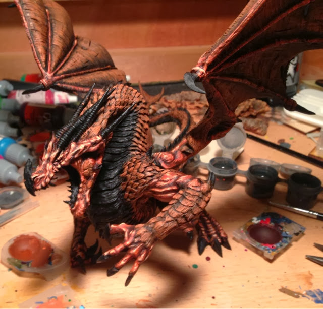
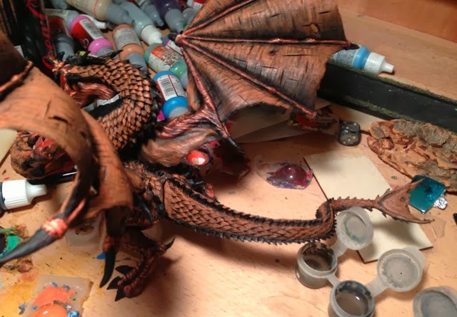
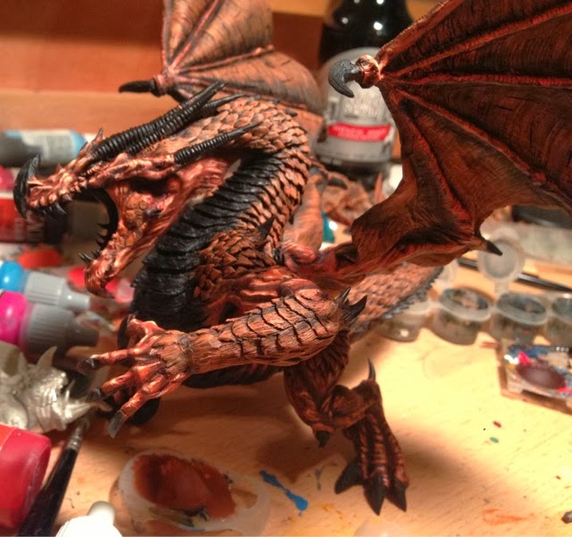
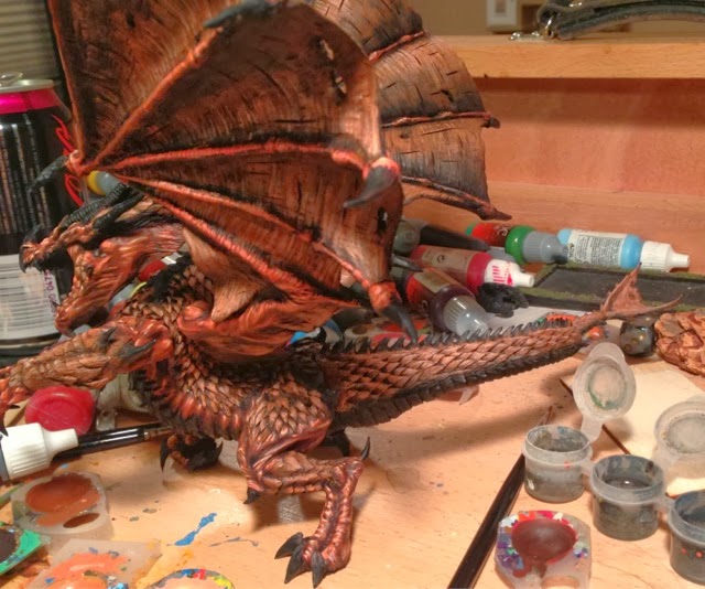
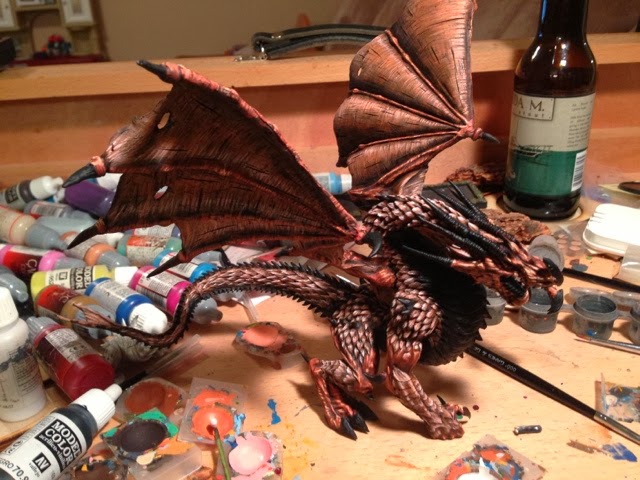
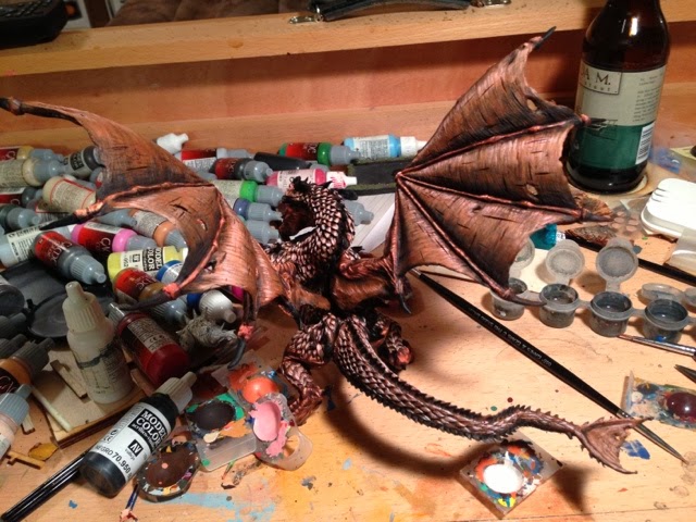
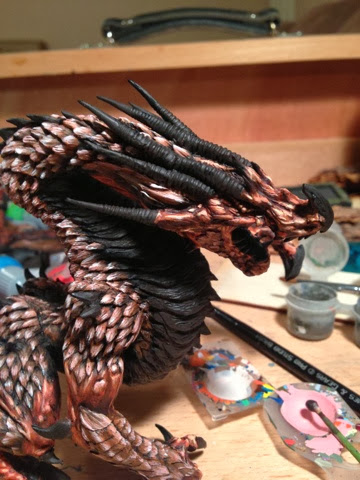
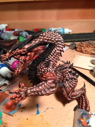
Razormage's Angrislaug WiP

For Work in Progress blogs.
User avatar
razormage
Posts: 147
Joined: Mon Feb 25, 2013 3:09 pm
Location: San Antonio, Texas
Contact:

Razormage's Angrislaug WiP

Postby razormage » Tue Feb 04, 2014 8:27 pm

Image
Here are all the components, spread out after cleaning them off in hot soapy water. The sprue on the top-left is the horns, the middle-left is the claws for the right hand, the two on the bottom are the talons for the wings, and the one in the top-right is the tail and tongue.

Mold Lines:
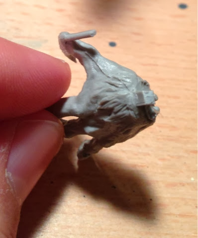
Any model this large is going to have mold lines. The question is how critical they are to the sculpt. Most of them, like the one pictured below
Image
The mold line shown on this hand was easily trimmed down with a sharp knife. The tail and horns had a bit more significant mold lines, but they were primarily in places that would not be visible unless someone picked up the model.

Gaps:
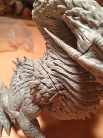
Any model this large is going to have gaps. Let's look at how noticeable they are..
Image
Two are shown here: the head/neck, and the right shoulder to the body. Both were easily greenstuffed (see below).
Image
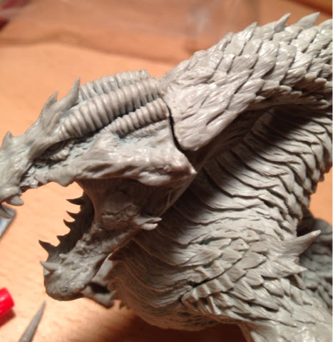
The head-neck gap still had a bit more issue, but look at how cleanly that left arm fits into the body! One of the best seams I've ever seen on a model, right there.
Image
Another shot of the head/neck joint.
Image
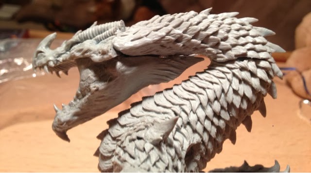
The neck/body seam is a bit obvious from below, but is largely unseen if you view the model from a player's viewpoint.
Image
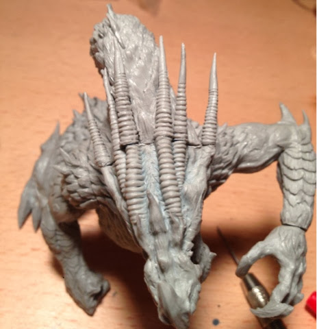
I also had some gaps you could see between the lower jaw and the body, but these were really easy to fix with greenstuff.
Image
The horns and back of the head needed a bit of adjustment to fill the seams, as did the wrist to the left hand.

Air Bubbles:
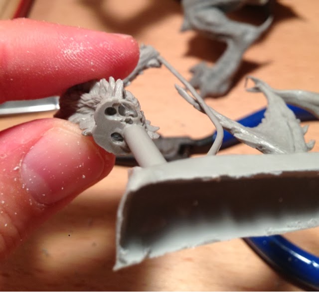
I had three air bubbles that could be clearly seen in the resin.
Image
The first, in this tail (next to the perfectly round hole) made the fit difficult, but couldn't be seen once the tail was assembled. The second was actually inside a wing, and could be seen if you held it up to the light, but was completely enclosed. The third was on the body just before where the tail connected, and actually was in place of a horn. I intended to replace it with green stuff, but once the wings were in place it was very difficult to see, so I might leave it alone.

Assembly:
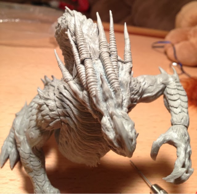
The biggest problem I had with the assembly came with the horns; I could not figure out if they went left to right, or right to left. I e-mailed Mierce and got the response (sadly the next day) that the horn labeled I went on the model's left cheek, and they moved from that cheek across.
Image
Mine are all kinds of wrong, and are (from right cheek to left cheek, left to right across the screen): I, V, III, IV, II, VI. In the end, I just put them in the way that fit best. III was the only one that didn't seem to line up correctly with any of the others, and I ended up greenstuffing the transition to make it work.
Image
The right claws slot into the holes shown above. I strongly recommend pinning the thumb (labeled IV on the sprue).
Image
See those thin plastic pegs connecting the claws to the sprue? DO NOT CUT THOSE! If you do, you're going to have to pin those claws to the foot. I made that mistake with two of them, and had to pin both.
Image
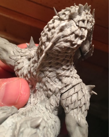
This shot shows the hole where the right wing is supposed to slot in. This must have been one of the last casts they used from this mold (they re-made the mold the day after this was cast), because the hole is almost completely filled in with a resin plug. It's not a big deal though, as you'll see when I show you how I'm attaching the wings.
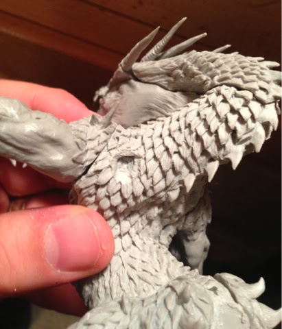
Image
This is what the hole should look like on your model: a nice, clean channel for the wing peg to slot into.
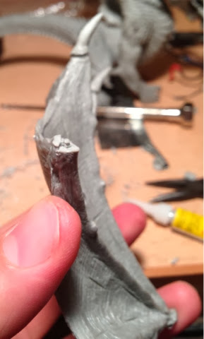
Image
The only mold slippage issue I had: this join for the wing talon should be flat, but you can see the mold slipped a bit just to the left of the peg. It was easily corrected with a knife. I was worried about which tips went on which wings, but it's easy to tell: one wing has pegs and the tips have holes, while the other wing has holes and the tips have pegs. I strongly recommend replacing the pegged wingtips with pins, but the other one seems to be holding well.
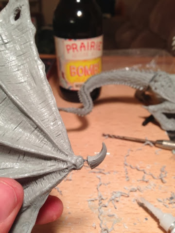
Image
I also recommend pinning the talon on the top of the wing, as it's in a position that will break off very easily.
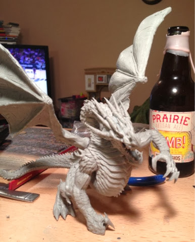
Image
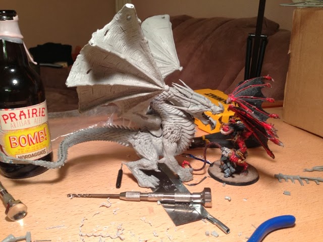
I pinned the wings and tail with paper clips initially, just to set up this photo. That will change shortly.
Image
While I had him pinned together roughly, I grabbed my Bloodthirster just to emphasize how big this dragon is. It's very, very, very large. See that giant drill bit in the pin vise? Let's use that next!

Gap filling/pinning the wings and tail:
This model is going to be traveling, and will have to make at least one airline trip. To make it easier to put into foam, I decided very early that the wings and tail would be detachable, to reduce its footprint.
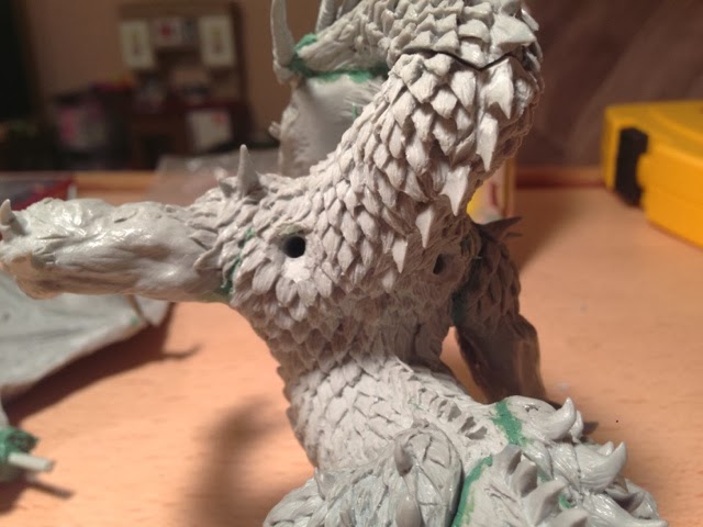
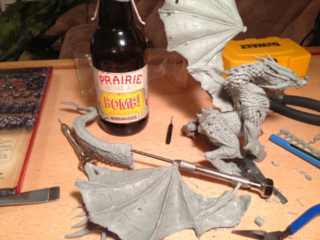
I have some round plastic sprue from an old model airplane kit that I keep around for use as rod, and so I pulled it out of a cubbyhole, and grabbed the 1/8" drill bit that I know works for it. Using the channels I'd already drilled for my pins, I drilled them out. With a 1/8" drill bit.
Image
The wing receptacles, with 1/8" holes drilled in them.
Image
Drilling out the bottom of the tail with a 1/8" drill bit.
Image
The pinned tail, partially inserted into the base of the model.
Image
The left wing showing the pin coming out. The greenstuff here is purely to fill the gap; I'll sculpt the texture over the top tomorrow when it's set.

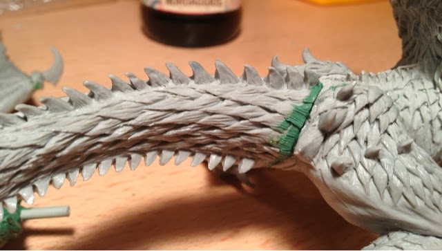
Gap filling
Image
Here's the greenstuff to fill the gaps in the tail.
Image
Greenstuff filling the gaps around the head (including a custom scale between the bottom and second horn), and a fake horn rim to bring the sizes closes together.
Image
The right shoulder and hip required very little work to fill the gaps.
Image
The gap fill on the left side of the tail.
Image
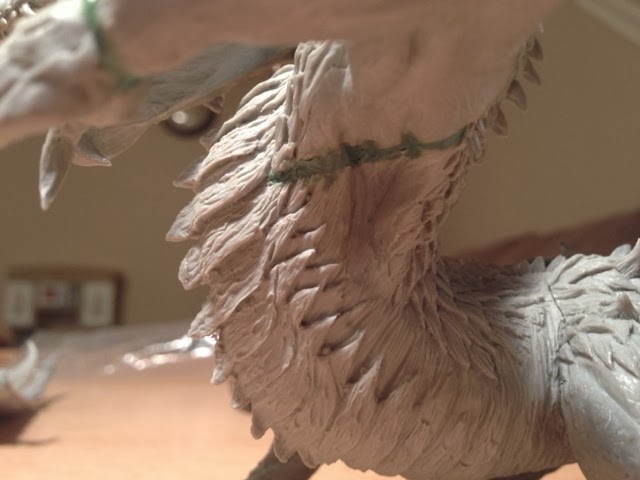
Another custom scale to fill the gaps between the bottom and middle horn on the left, as well as the gap between the lower jaw and the neck.
Image
The biggest gap in the model, underneath the left arm, was pretty straightforward to fill. At 2 AM, though, I quit working on him without taking a finished assembly picture - I needed sleep!

The tasks tonight: finish filling the gaps between the wing and torso, and take shots of the final assembled model!

After that I'll take a couple of scale shots, and do a final review. For now, though, enjoy the process!

--Ryan Smith
Blog: http://thebeerwaaagh.blogspot.com/
Twitter: @beerwaaagh
Aniku
Posts: 80
Joined: Mon Apr 08, 2013 9:47 pm

Re: Razormage's Angrislaug WiP

Postby Aniku » Wed Feb 05, 2014 8:42 am

This is a great post!!!!

Very useful for those that got Angrislaug on KS1.

Seeing the size of it and not buying it in the first place makes me feel like a stupid ass...

Now, when will you begin painting that super dragon??

Many thanks,

Adiós!!
User avatar
razormage
Posts: 147
Joined: Mon Feb 25, 2013 3:09 pm
Location: San Antonio, Texas
Contact:

Re: Razormage's Angrislaug WiP

Postby razormage » Wed Feb 05, 2014 12:58 pm

Aniku: How about last night? First, though, the last of the assembly pictures...

Well, last night was the last night that the temperature was high enough and the humidity low enough for priming, so I raced through the last of the gap filling and got the big boy primed. As a result I had to skip a few of the in-progress assembly photos I'd hoped to take, in the interest of having a week to paint him that I'd lose if I didn't get him primed!
Image
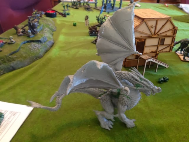
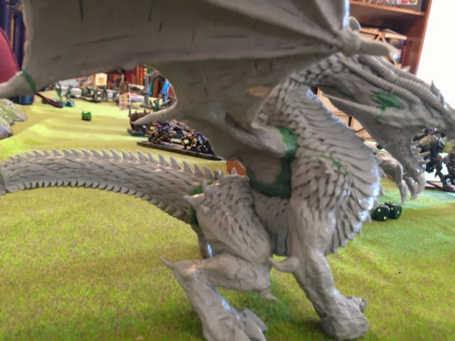
Here he is crashing an in-progress game of Warhammer. As solid as he looks, the wings and tail are not glued there. Those thick plastic rods are long enough to hold the weight of the wings and tail without falling off. The greenstuff there is designed to further support that hold and prevent the wings from spinning out of control.
Image
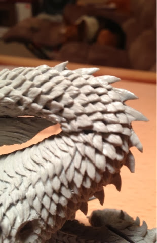
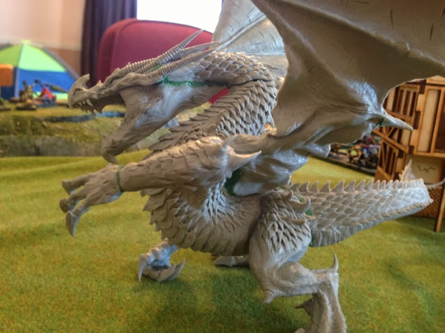
Here you can see the greenstuff supporting the right wing. It's carefully sculpted on the shoulder to maintain the flow of the scales and shape of the shoulder. The connection of the wing to the lower body is a little looser because there's an amount of wiggling involved in attaching/detaching the wings for storage. In the end, I don't think that little gap is going to be obvious enough for people to notice it in the context of the model.
Image
You can see a similar amount of gap on the right wing, but again, if people are noticing this then I have done a poor job of painting.
Image
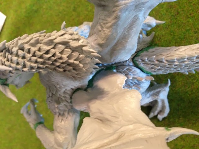
Finally, a look down the center of the model from above, to show how the two wings roughly fit together (in answer to a question about where to position the wings). Notice that the seam between the neck and the body (that I mentioned earlier I didn't intend to gap fix) is completely invisible when viewed from above.

So, there's Angrislaug assembled! As with any large models, there were a few join issues and gaps, and a few mold lines. For the most part, these are disguised in the flow of the model, and as mentioned above, I didn't even feel like some of the gaps needed to be filled. For the most part the mold lines were able to be filed down without compromising the details of the model.
--Ryan Smith
Blog: http://thebeerwaaagh.blogspot.com/
Twitter: @beerwaaagh
User avatar
razormage
Posts: 147
Joined: Mon Feb 25, 2013 3:09 pm
Location: San Antonio, Texas
Contact:

Re: Razormage's Angrislaug WiP

Postby razormage » Wed Feb 05, 2014 1:28 pm

First off, I forgot to hot-link to the Angrislaug assembly thread on my blog here. It's got a final grade on there that I don't want to degrade the Mierce forums with, so if you want to see how I scored it, you can check it out there.
Now, for what everyone (or at least, like, a handful of you) want to see: paint!

Remember back when Krull intimidated me enough that I put him on a shelf back in September and haven't touched him yet? Angrislaug really, really wanted to do the same thing to me.
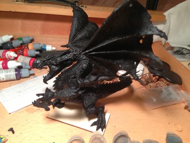
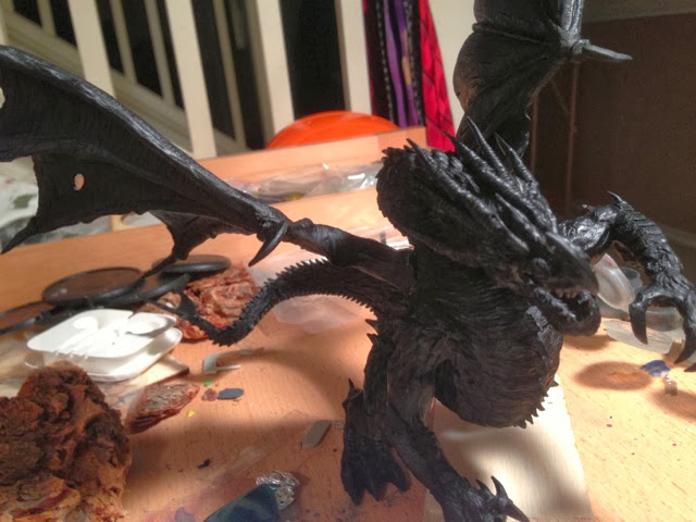
Image
See how awesome he is? Check out all his majesty!

I spent an hour last night after priming him just staring at him, trying to figure out how I wanted to paint him up. I went online and started researching draconic color schemes, trying to find one that was just right. When I finally did, and clicked the thumbnail: surprise! It was Sebastian Picque's official Mierce-commissioned Angrislaug. While I try to use the manufacturer's original color schemes where I can, I know that I'm not at Sebastian's level of painting, and just trying to copy what he did is would result in a poor copy of what he did. His work is amazing, and brilliant, and there's a reason that he's paid a lot of money to paint models on commission, and I just paint stuff and post it on a blog.
Image
I grumbled for a bit, and opened a bottle of my second-favorite beer: Avery's Samael (16.8% ABV). I started getting ideas. The Samael ran out, so I poured a pint of my Krull's Sabbitical clone of Avery's The Beast (15% ABV). I drank that pint, too. I started feeling a bit better.
Image
Finally, I pulled out my paint and just started throwing it down on a piece of wood.
Image
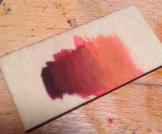
Hey, look, an out-of-focus color scheme! I was literally just mixing drops of paint together and slapping them down. However, it provided me a flash of insight. The swatch above is a mix of reds and browns. While I stared at it, I had a nice buzzed flash of insight. My resolve set, I started mixing paint and set of on what I hope will be the coolest paint job I've ever done.
Image

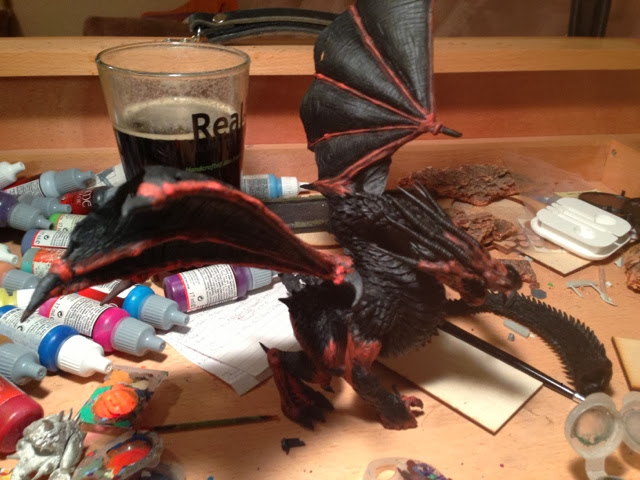
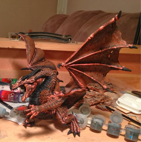
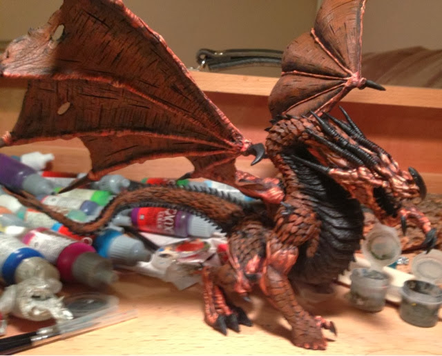
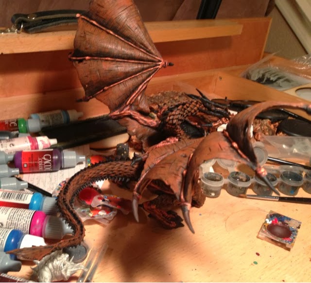
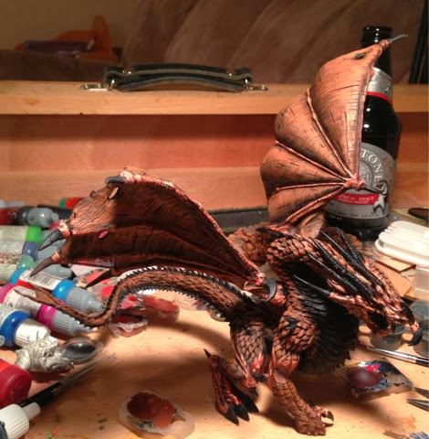
I decided to paint Angrislaug in sections. The model is designed to be detached into four parts - a body, two wings, and a tail - and I'm probably going to paint him in those sections.
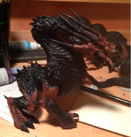
The buzzed flash of insight I had was to split my color palette to differentiate between Angrislaug's bare hide, and his armored scales. The palette I mixed above was equal parts of red to brown. For the model, I'm going to throw that proportion off: the skintone will be 2:1 red to brown, and the scales will be 2 brown to 1 red. This will do two things: it will set off the scales and allow me to keep them separate (and darker) from the skintone, which will let me emphasize the shine on them, and it will make this model different from Mierce's official model.
Image
The first layer of red is 2 parts of Vallejo Red to 1 part SS camo Black Brown. I mixed 8 drops to 4, and then added two drops of black to make the tint dark. I'm deliberately trying to keep my colors dark here, to fit the aesthetic of the Darklands, and keeping the option open for me to do some cool source-lighting tricks. I'm using browns instead of yellows for the mix color for the same reason: it'll let me do some source lighting in yellow and make it distinct from the colors actually used to paint the model.

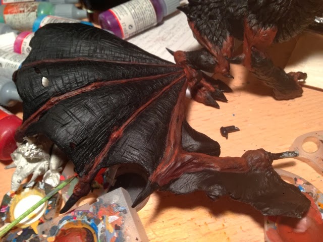
The first shade completed. I've also decided that the underbelly is going to be a lighter shade of brown, and I'm intending to use that lighter shade on the wings (hence why the area between the finials is still black).
Feeling less intimidated, I poured myself a pint of Karbach's Sympathy for the Lager, and kept working.

Image
The second shade is 2 parts Vallejo Red to 1 part Beasty Brown. This time I did the 8:4 mix, but added a single drop of black to keep it dark.

Image
A shot of the wings, to show that they're getting painted too! The tail is getting neglected in this layer, but I'll live with that.
Image
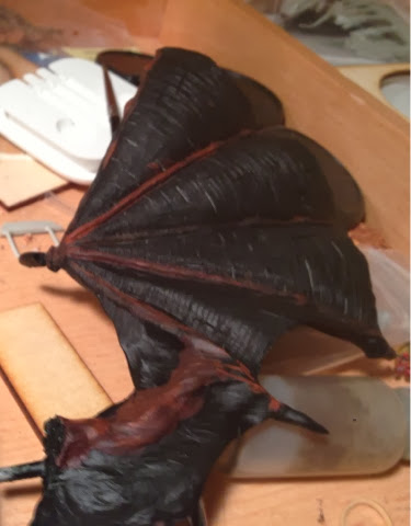
A reverse of the second layer. I'm two layers in, and pour myself another pint.
I painted a third layer (using Vallejo bloody Red and Beasty Brown), but finished at about 2 AM, and with quite a buzz going from all the beer. As a result, I forgot to take pictures of the status! I'll start tomorrow's update with those pictures. Sorry for the inconvenience.
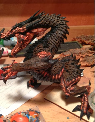
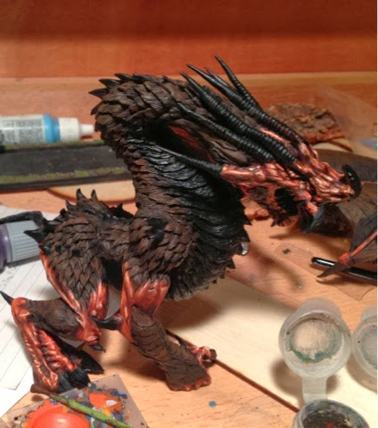
This post on my blog is serving as the repository for the images, so feel free to check it out if you don't want to wait for me to paste it over here (which takes a bit of time). I'll be trying to update it every night I paint (just by dumping commentary-free images on it), so it's the most up-to-date place to find what I'm doing!
Last edited by razormage on Mon Feb 10, 2014 3:19 pm, edited 1 time in total.
--Ryan Smith
Blog: http://thebeerwaaagh.blogspot.com/
Twitter: @beerwaaagh
Quuids
Posts: 51
Joined: Wed Jun 19, 2013 9:43 pm

Re: Razormage's Angrislaug WiP

Postby Quuids » Wed Feb 05, 2014 3:48 pm

Fantastic stuff, you have no idea how much this is going to help me. Thank you so much for the effort you put into these posts. I for one, really appreciate it.

Keep up the great work and I'm looking forward to seeing more!

-Quuids

Edit: typo
User avatar
razormage
Posts: 147
Joined: Mon Feb 25, 2013 3:09 pm
Location: San Antonio, Texas
Contact:

Re: Razormage's Angrislaug WiP

Postby razormage » Thu Feb 06, 2014 2:40 pm

I'm glad the assembly post is being helpful and enjoyed! I wish my paint job was doing the model justice, as I'm very disheartened with where I am right now. I just have to keep reminding myself that I haven't done the last few highlights, and they're the ones that make the model look amazing. Here's what I accomplished last night.

Image
Well, as promised, we'll start off with the third layer from yesterday. This one is 2 parts Bloody Red : 1 part Bestial Brown. No black was added, which is why it's so crisp.
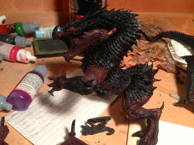
Image
A reverse of the third layer. I'm using a Size 2 brush from Games & Gears, and viewing it today realize I was doing a lot of drybrushing, which I try to avoid. We'll see if I can rescue the paint job in the next few layers...Image
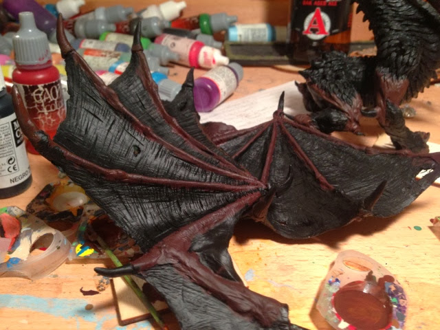
The third layer on the left wing.
Image
Third layer on the right wing. No politics jokes, please.

Image
Here's the fourth layer. I switched to a Games & Gear 0 for this one, but it's still looking a lot more drybrushed than I want, and I feel like I'm losing a lot of detail. I might have to just start over if I can't fix it.
Image
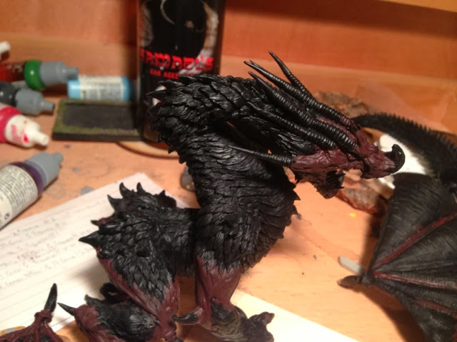
A close-up on the face for the fourth layer. You can see the rough transition strokes from the drybrushing. The fourth layer is 2 parts Bloody Red : 1 part Plague Brown.
Image
The left side, fourth layer.


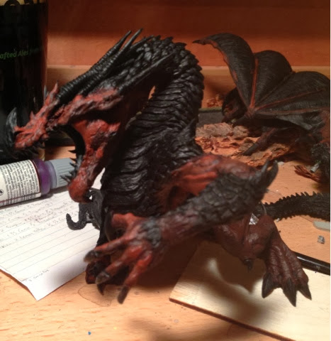
For the fifth layer I switched over to a Winsor-Newton Series 7, and upped the mix to 2 parts Hot Orange : 1 part Plague Brown.Image
You can see that the colors are starting to pop out in my typical style.

Image
A reverse view of the fourth layer. The Winsor-Newton brush is giving me more control, but I'm still not satisfied, as you'll see in a second.

Image
Here's a close up (and for some reason poorly exposed) shot of the head. I can see really rough transitions in this layer, and feel like I'm trashing a lot of the detail with this paint job. At 2 AM I quit for the night, thoroughly disheartened.

Once in bed, I laid awake for a while trying to figure out how I'm going to salvage the paint job. For now, I think I'm going to do the last two layers of highlights, and then see if I can run a midtone red glaze to clean up the transitions. If that doesn't work, well, I can always paint over it! We'll see what tomorrow brings!
--Ryan Smith
Blog: http://thebeerwaaagh.blogspot.com/
Twitter: @beerwaaagh
User avatar
razormage
Posts: 147
Joined: Mon Feb 25, 2013 3:09 pm
Location: San Antonio, Texas
Contact:

Re: Razormage's Angrislaug WiP

Postby razormage » Mon Feb 10, 2014 3:17 pm

Who wants to see more Angrislaug? This guy!

Image
Friday night, I resolved to plow along and see how it looks with all the highlights done. So resolved, I mixed a concoction of 3 Hot Orange : 1 Dwarf Flesh. I dropped brush size to a 00, and set to work!
Image
The reverse of the face. There are places the highlights are working - like the feet and hands - and places they are not - like the biceps.
ImageImage
The two wings get off pretty easily, because they're only minor amounts of painting.


Image
For the sixth layer, I went all dwarf skin. This had the effect of "yellowing" the skintone, but it was required because the orange was just pulling the shade too dark.
Image
At a distance, the transititions don't seem so bad.
Image
In the close-up of the face, you can see that the transitions are looking cleaner as the highlighting continues. It's the larger, flatter areas that seem to be suffering from the style.
Image
Stuck the wings back in for a full-body shot.
Image
For the final layer, I added some white to the last mixture and used it very sparingly.
[img]https://lh3.googleusercontent.com/-m65yL6z-GVE/UvjprKjGN0I/AAAAAAAACKI/Su5EyvskTOo/s640/blogger-image--971964733.jpg/img]
Again, it's working on the smaller portions, but I'm unconvinced about the larger. Maybe it's because there are large, unpainted black areas tricking my eye? I guess that's the next stop!


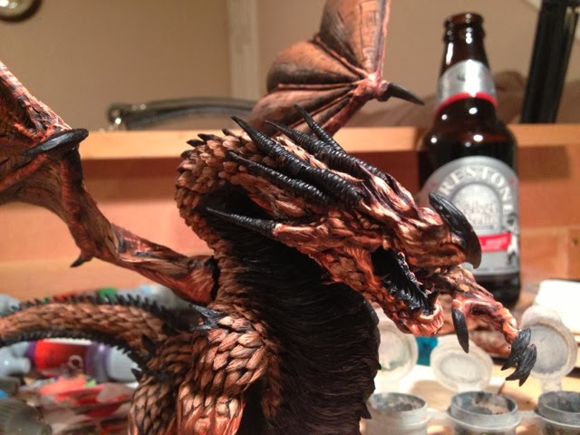
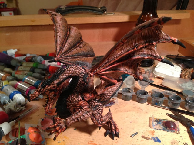
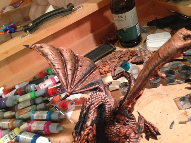
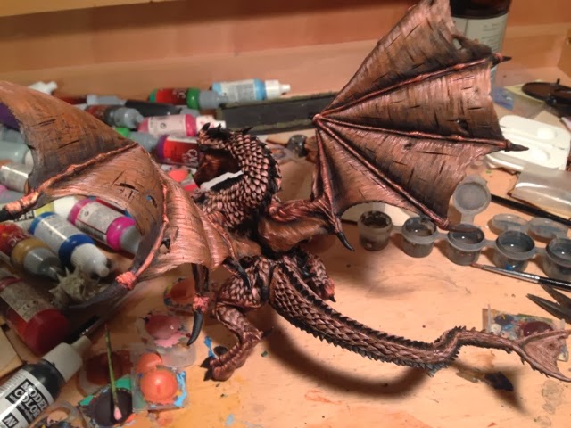
After taking Saturday night off for some much-needed sleep after eight 2-AM nights in a row, I started Sunday on the brown shade. These will be used for the scales on the top of the model and the interior of the wings.
Image
For the first blurry layer, I started with 6 parts SS Camo Black Brown : 3 parts Red : 2 parts Black. See the symmetry between this color and the reds? Yep, the reds and browns are reversed. Hopefully it will make the model seem cohesive, with the same tints running throughout.
Image
A shot of the base coated wings.
Image
The inside gets the same layer as the outside, though the highlighting will be inverted.
Image
Finally, some paint on the tail!

Image
For the second layer, I used 6 parts Bestial Brown : 3 parts Red : 1 part Black.
Image
You can see that the contours of the scale, along with the texture sculpted into it, is going to make my life a lot easier for this shade than the red. I can be lazier painting, and let the model do more of the work!
I hit 1:30, and called it a night. Tonight, I hope to get three more layers down on the brown. We shall see how I can do; the middle layers seem to take the longest!
--Ryan Smith
Blog: http://thebeerwaaagh.blogspot.com/
Twitter: @beerwaaagh
Malachi B.
Posts: 67
Joined: Fri Jan 17, 2014 4:36 pm

Re: Razormage's Angrislaug WiP

Postby Malachi B. » Mon Feb 10, 2014 4:01 pm

Hey Ryan, i think is gonna be a stunning model! I really like the color choice, and u are doin a great job on that. Take your time and make him mighy! ANd this deserve a mighy base too! And now i'm tempetd to buy this beast too.......i always told myself i could resist some dragons and big demons.....but seein you guys paintin them, well...
User avatar
AndyP
Posts: 304
Joined: Mon Feb 25, 2013 2:31 pm
Location: Stoke on Trent, Staffordshire, UK

Re: Razormage's Angrislaug WiP

Postby AndyP » Mon Feb 10, 2014 6:43 pm

Looking much better now Ryan. Makes a big difference getting another colour on instead of the black undercoat. Keep up the good work ;-)
As I always say. At the end of the day.................it goes dark :-)
User avatar
razormage
Posts: 147
Joined: Mon Feb 25, 2013 3:09 pm
Location: San Antonio, Texas
Contact:

Re: Razormage's Angrislaug WiP

Postby razormage » Tue Feb 11, 2014 2:09 pm

Image
For the third layer, I chose to skip the Hot Orange mix I'd used for the reds, in the hopes of keeping the tint on the browner shade. This one is 3 parts Bloody Red : 6 parts Bestial Brown.

Image
It's going very burnt orange, and I'm not sure how I feel about that.
Image
On the reverse, you can see the difference in tint on the midtones between the scales and the skin.
Image
The model's so large, my phone's having trouble keeping it in focus! Here's a reverse of the third layer.

Image
For the fourth layer, I used 3:1 Dwarf Fleshtone to Bloody Red.
Image
You can see those two color swatches starting to blend into each other. Here's hoping the final stages of highlighting will separate them again!
Image
A shot of some of the wing detail, which looks kind of sloppy this morning.
Image
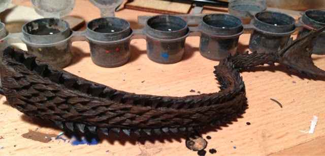
A shot of the scales along the tail, and the back.
Image
A close-in shot on the head.
Image
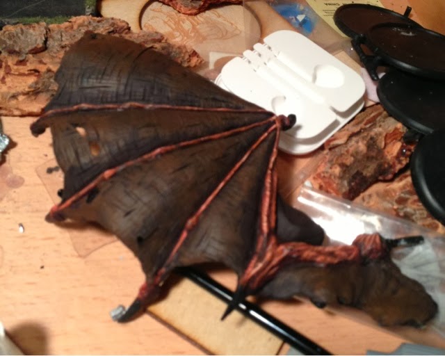
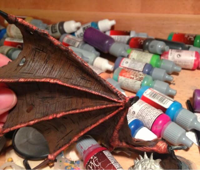
A shot of the wing interiors. I think they're going to need a glaze at the end to clean up some of the muddiness.
Image
Along the flank, showing the torso scales and interior of the left wing.

Image
For the next layer, I kept the 1 part bloody red, but this time used 3 parts Pale Flesh.
Image
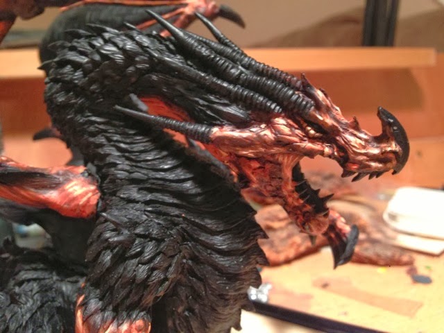
A close-in shot of the head, right shounder, and neckline, with the wings and tail in the background.

Tomorrow's task: the last two highlights of the scales, and then we move on to the last color mix: the claws, teeth, horns, and chest scales!
--Ryan Smith
Blog: http://thebeerwaaagh.blogspot.com/
Twitter: @beerwaaagh
Aniku
Posts: 80
Joined: Mon Apr 08, 2013 9:47 pm

Re: Razormage's Angrislaug WiP

Postby Aniku » Tue Feb 11, 2014 3:01 pm

He is big, he is red and he is coooooool...
Quuids
Posts: 51
Joined: Wed Jun 19, 2013 9:43 pm

Re: Razormage's Angrislaug WiP

Postby Quuids » Tue Feb 11, 2014 5:20 pm

This is incredible, everyone on this forum is very talented! I'll be following your steps with similar colors when I have the courage to put him together.

Thanks for all the photos and keep them coming!
User avatar
razormage
Posts: 147
Joined: Mon Feb 25, 2013 3:09 pm
Location: San Antonio, Texas
Contact:

Re: Razormage's Angrislaug WiP

Postby razormage » Wed Feb 12, 2014 9:18 pm

Another day, another update! Last night I finished off the white/red for the scales and wings, and started on the chest plate, claws, and horns.


Image
First off, someone on Dakka asked for a scale pic, so here's Angrislaug with a Savage Orc. Yes, I'm still too lazy to go upstairs into my office and grab a Space Marine.
Image
Next to last highlight was pure Pale White, as the Elf Flesh was going a tad more pink than I was hoping for.
Image
You can see the difference in highlight intensity between the scales and the wings; while both are the same color range, this should make them appear to be different.
Image
A closer shot of the tops of the wings.
Image
A reverse view showing how the scales seem to be going bone colored, while the wings go light red/orange.
Image
For the final highlight on the scales, I broke my normal rule and went pure white. Usually I'd do a 50/50 of Pale Flesh to white, but I really wanted the scales to have a hit of glossiness to them. As usual, this final layer is what gives it that "pop". This was done very delicately, with a Winsor-Newton 000 brush.
Image
Front-angle shot of the final scale highlight.
Image
Again, a reverse view showing the difference between the wing highlighting and the scales.

Once the scales were done, I threw down a very fast layer for the next component: the horns, claws, and chest (aka the "bony bits").
Image
I started with my favorite brown utility color, SS Camo Black Brown.
Image
There's not much of a visual difference between that and the black primer, is there?
Image
One quick, final, 2-AM-semi-blurry shot of the next layer, which was 50/50 SS Camo Black Brown and Leather brown.
--Ryan Smith
Blog: http://thebeerwaaagh.blogspot.com/
Twitter: @beerwaaagh
Aniku
Posts: 80
Joined: Mon Apr 08, 2013 9:47 pm

Re: Razormage's Angrislaug WiP

Postby Aniku » Thu Feb 13, 2014 9:13 am

You did a damn quick great job!!!

Have you think to wash some parts of the miniature with blue or purple to create more tones on the miniature?

Many thanks.

Adiós!
User avatar
zedmeister
Posts: 131
Joined: Mon Feb 25, 2013 2:26 pm
Location: Mercia, UK
Contact:

Re: Razormage's Angrislaug WiP

Postby zedmeister » Fri Feb 14, 2014 12:38 pm

Lovely work so far.

Also, isn't she a she?
grefven
Posts: 149
Joined: Mon Feb 25, 2013 6:26 pm

Re: Razormage's Angrislaug WiP

Postby grefven » Mon Feb 17, 2014 9:52 pm

Looks awesome to follow this progress. :)
User avatar
razormage
Posts: 147
Joined: Mon Feb 25, 2013 3:09 pm
Location: San Antonio, Texas
Contact:

Re: Razormage's Angrislaug WiP

Postby razormage » Wed Feb 19, 2014 1:57 pm

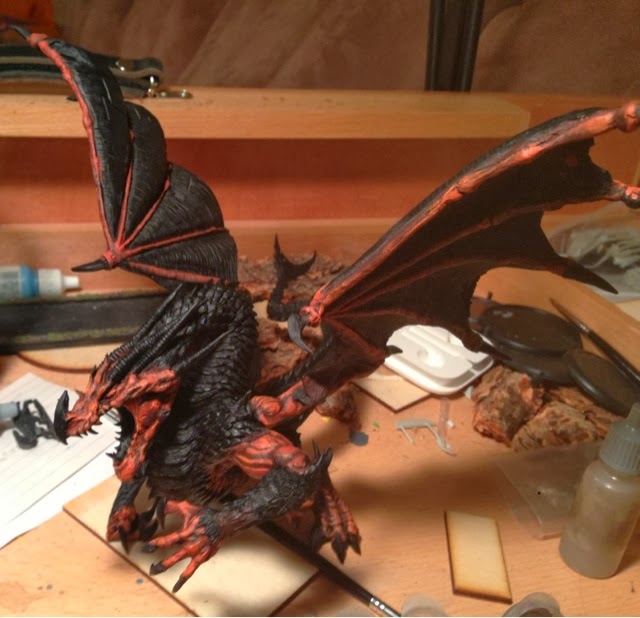
Thanks for the encouragement, guys. I got her 98% finished last week, but for some reason my phone has been unwilling to update blogspot (which I use for my image repository) until now. Let me know what you guys think! In a non-typical fashion, I even have lessons learned for myself at the bottom.

Image Image
First layer on the "bone" colors - a 50/50 mix of SS Camo Black Brown and Leather Brown.
Image
The second layer was all Leather Brown.
Image
Looking at the layer closer, I probably should have done a 2:1 Leather Brown to SS Camo Black, but I've done what I have done!
Image
A distant shot of the third layer, which was 50/50 Leather Brown and Bone White.
Image
Fourth layer: all Bone White
Image
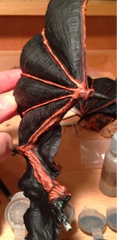
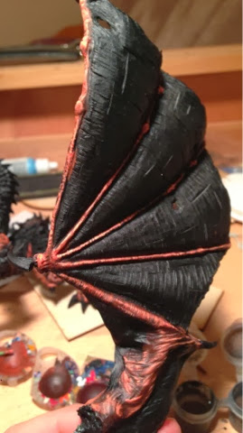
A close-up shot of the wing to let you see the detail of this sculpt!
Image
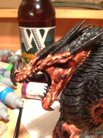
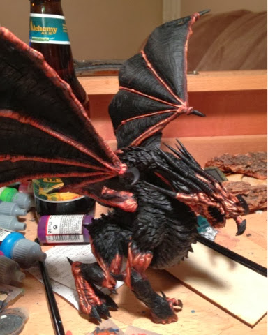
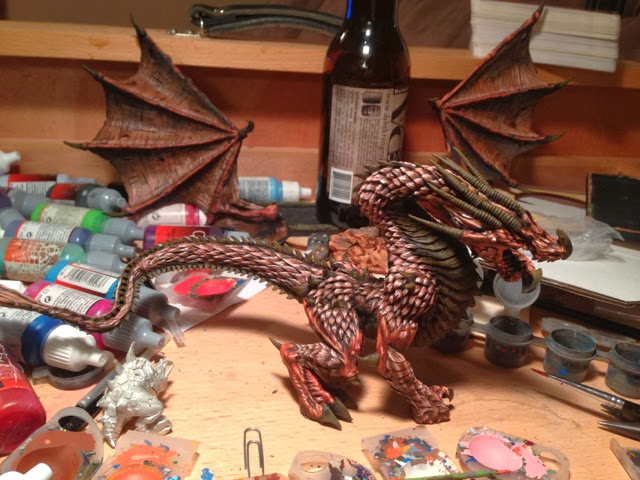
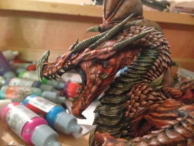
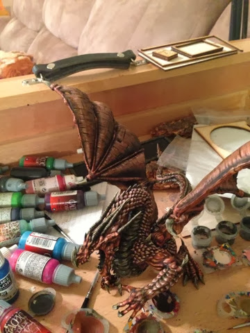
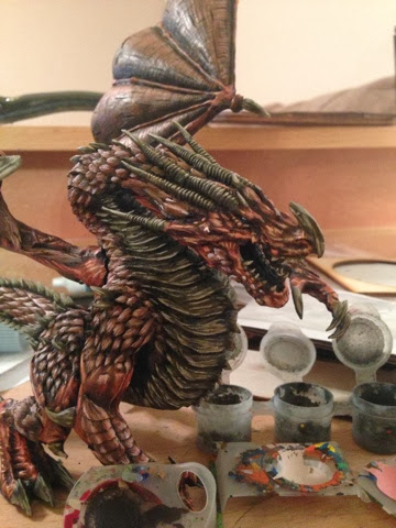
A distance shot of the next to last layer. I did one more after this at 50/50 Bone White to White, but I'm holding off on showing the final model in case I want to submit this to a WAMP contest.

The model was a joy to paint, and I enjoyed every single layer. Looking at it finished, I see areas I can improve if I want to paint a second Angrislaug.
First, I started my colors at least one layer too dark. On a model this large, I don't need to exaggerate the light/dark contrast as much as I do on an infantry model, so I don't have to draw the paint into darker shades as much. The contour of the models and natural shading will help that, and I don't have to force it so much with paint.
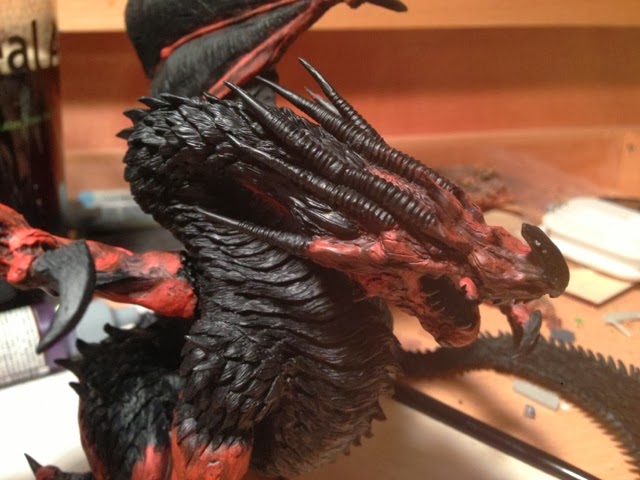
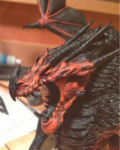
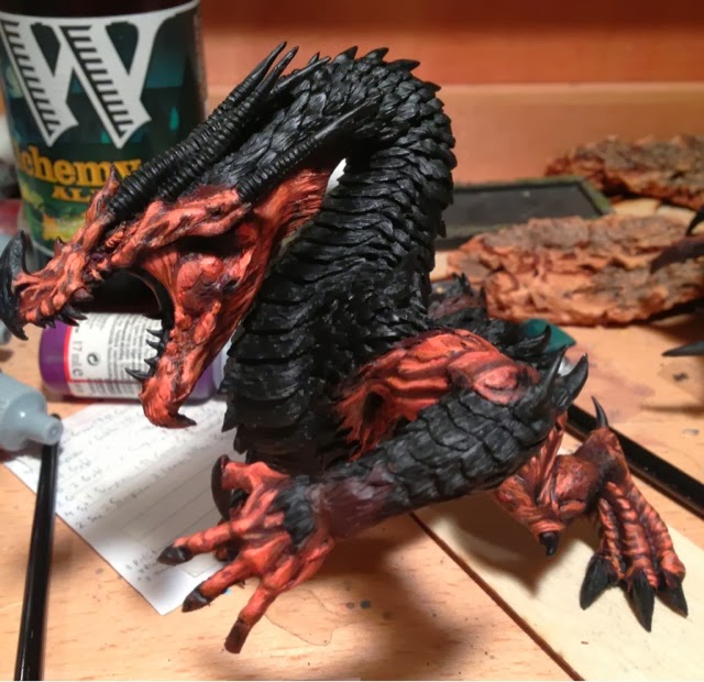
Second, my colors are too close together. The wings and wing membranes were supposed to be two distinctive colors, but they have drifted too close together because their last few highlights are almost identical. Similarly, the color of the scales is too close to the "bone" color I used. The palette decision was made in case I chose to source light the model (which I still intend to do at some point), where using yellows would interfere in that effect. As it sits right now, though, the model just sort of blends together.

Still, for what I accomplished in 10 days work, I'm pleased with myself. I'd give myself a solid B on this one, and look forward to improving on it with Angrislaug II: Angrierslaug!!
--Ryan Smith
Blog: http://thebeerwaaagh.blogspot.com/
Twitter: @beerwaaagh
User avatar
AndyS
Posts: 403
Joined: Mon Feb 25, 2013 4:53 pm
Location: Trowbridge UK

Re: Razormage's Angrislaug WiP

Postby AndyS » Wed Feb 19, 2014 8:54 pm

Amazing work Ryan! As for WAMP, I clarified with them last year, you can show the finished result here in the WIP. They just say it has to be 'new work' so that the same model doesn't get entered into lots of comps.

I'm dying to see the final pics dude!
Wyrd bið ful aræd
Malachi B.
Posts: 67
Joined: Fri Jan 17, 2014 4:36 pm

Re: Razormage's Angrislaug WiP

Postby Malachi B. » Thu Feb 20, 2014 3:36 pm

Impressive!

Return to “Work in Progress”

Who is online

Users browsing this forum: No registered users and 0 guests