Aniku's WIPs

Re: Aniku's WIPs
It looks great Aniku. But for me, aged nmm just does not work. It looks like awesomely painted leather armour to me!
Wyrd bið ful aræd
Re: Aniku's WIPs
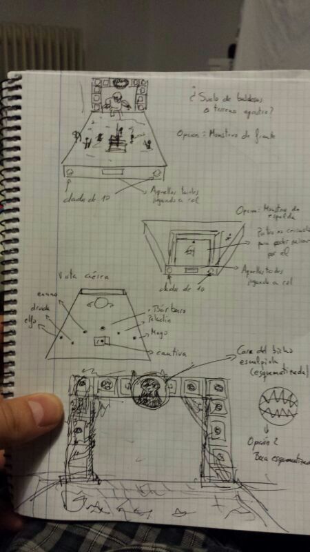
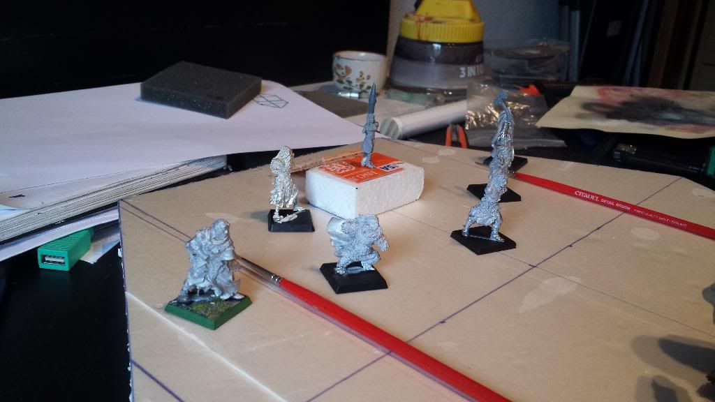
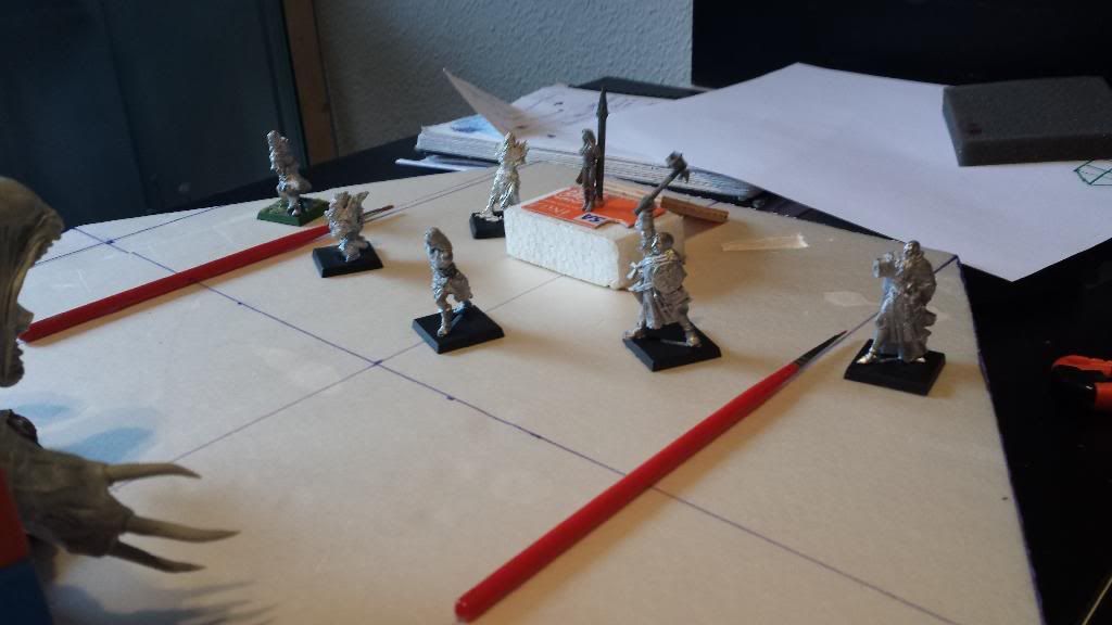
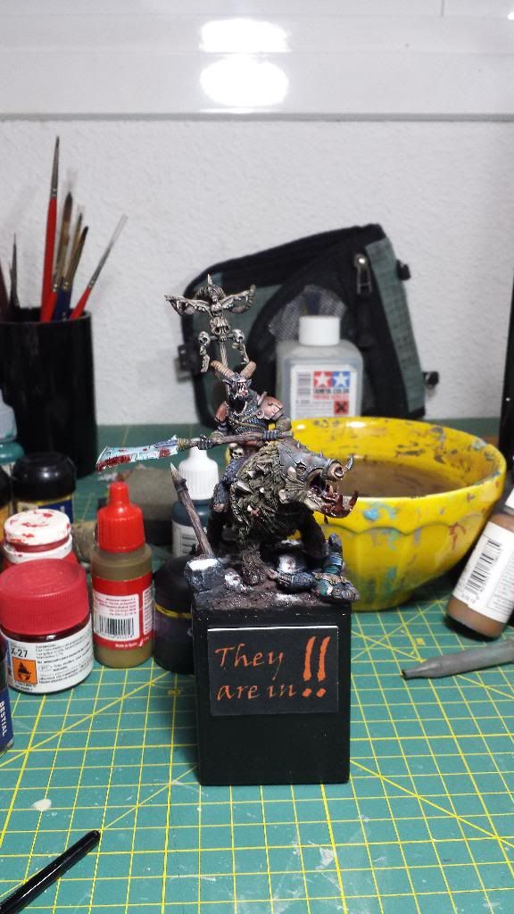
Well, so you can see that I am not only with the beast-man I post here the mega-project in which I'm getting involved.
Before I begin to show you it, I want to make clear that it is a very long term project. So until October or December I don't have in mind having it finished.
Here you have some scheme of what I was thinking to do:
demasiadas cosas que hacer antes de empezar a hacer un diorama!!
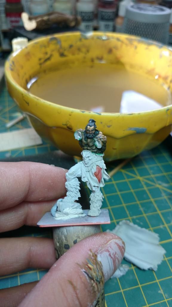
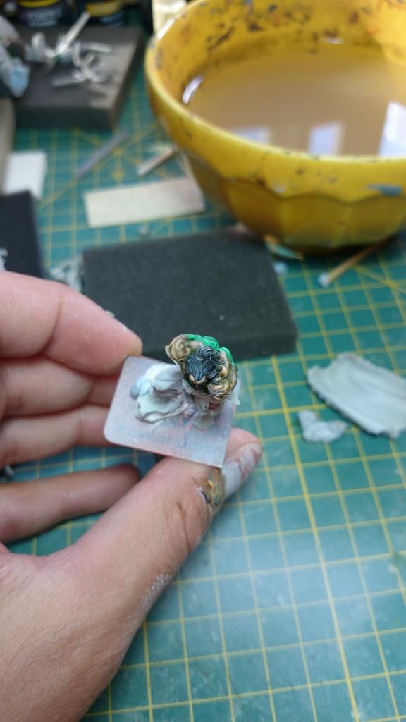
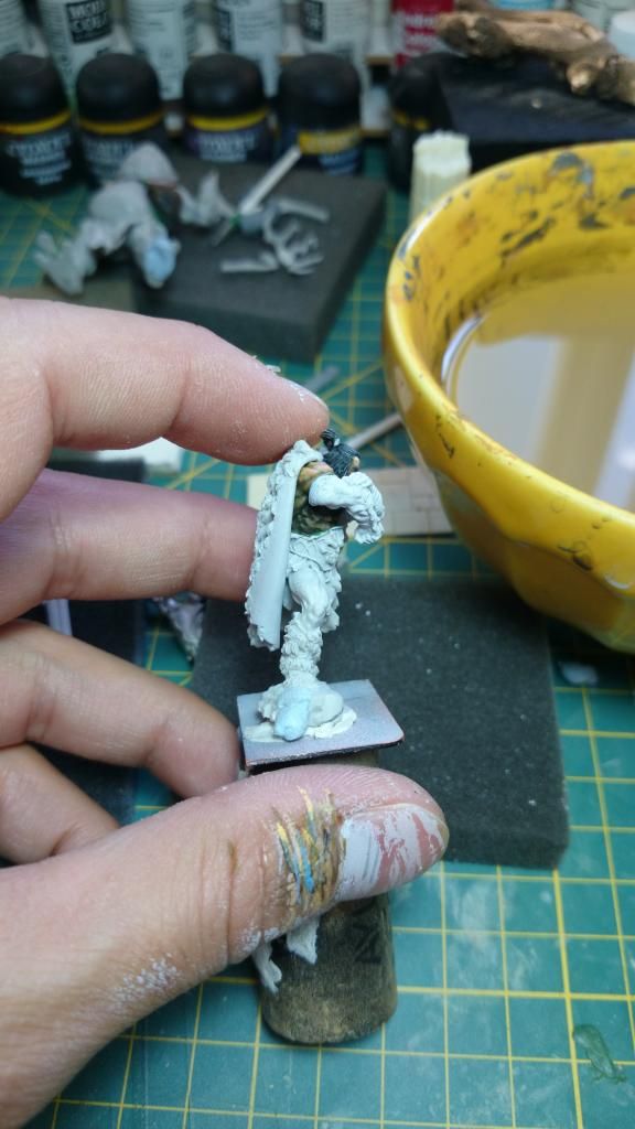
Here you have a proxy to show you what I have in mind...
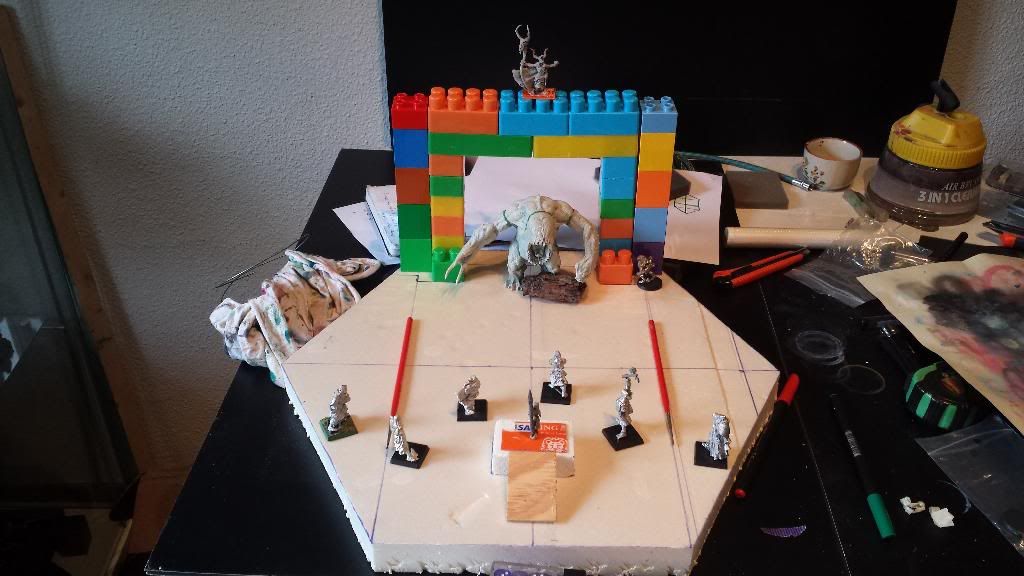
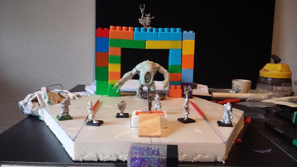
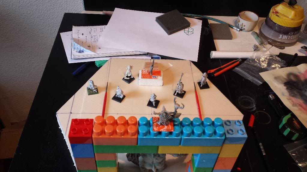
Yes. The typical issue of represent a little role playing game. The idea is to have a group of adventurers who want to save a maiden to be devoured by a monster. We can say that the girl has been kidnapped... blah blah blah... Above the gate we will find the evil character of the game (we'll talk about that).
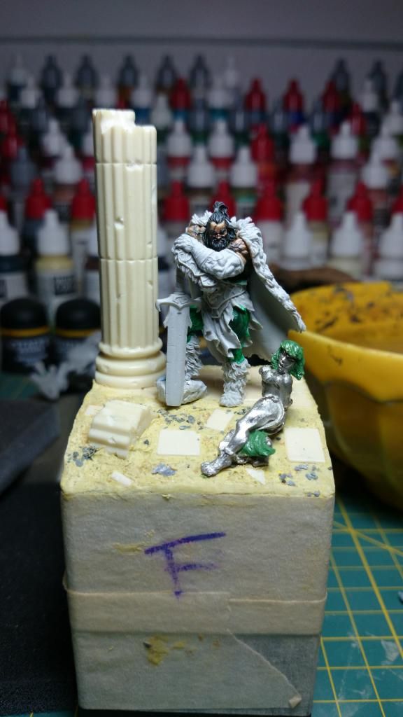
You will see that the miniatures change the position in the composition. I have no idea how to complete it. I think the composition ends like this:
Why? Easy, , We are going to build an electric swivel stand that will stop in each side. And I said "We" because my father is responsible for the technical aspects......
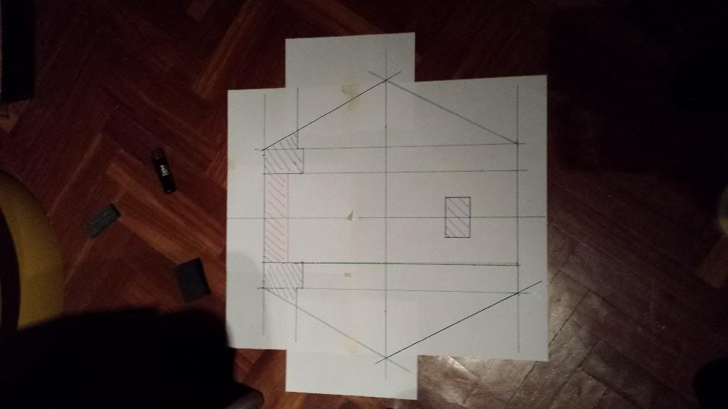
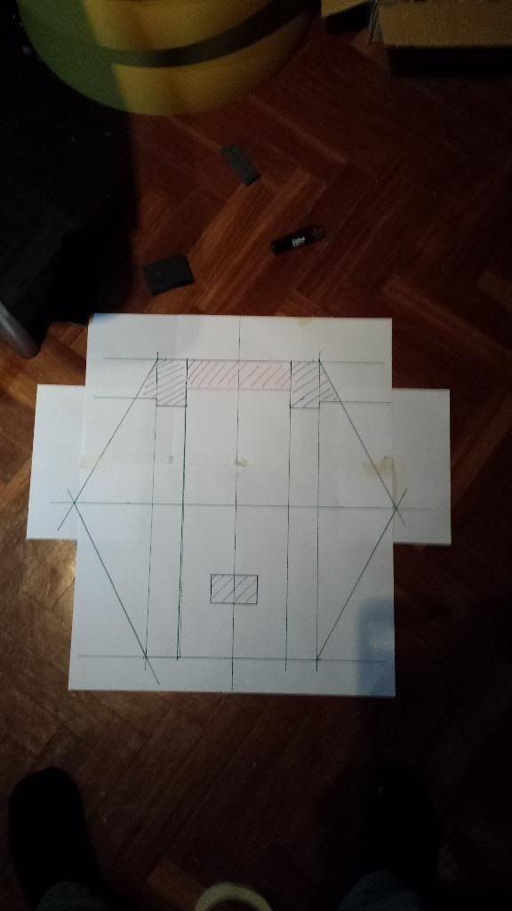
Many changes from the initial idea...
Why I post this now? Easy, I'm quite sure I'm going to need help.
Has someone been assembled a rotating base with a battery motor?
I need advices, tutos everything you think could help me with the scenery. How to build the floor, the gate...
What do you think about the composition?
You can talk about wahtever you want..
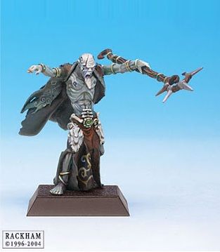
I have a direct question: Which evil character do you think will work better on the scene?
The crazy witch with tambourine who has kidnapped the girl out of envy?
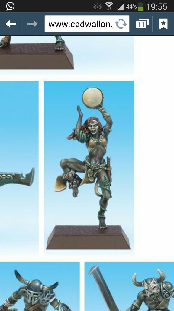
Or the wizard of a malevolent cult that searched a sacrifice for the representation of their God, the great hungry mouth?
Now, time to continue with the beastman...
Many thanks.
Adiós.
Before I begin to show you it, I want to make clear that it is a very long term project. So until October or December I don't have in mind having it finished.
Here you have some scheme of what I was thinking to do:


demasiadas cosas que hacer antes de empezar a hacer un diorama!!
Here you have a proxy to show you what I have in mind...


Yes. The typical issue of represent a little role playing game. The idea is to have a group of adventurers who want to save a maiden to be devoured by a monster. We can say that the girl has been kidnapped... blah blah blah... Above the gate we will find the evil character of the game (we'll talk about that).
You will see that the miniatures change the position in the composition. I have no idea how to complete it. I think the composition ends like this:


Why? Easy, , We are going to build an electric swivel stand that will stop in each side. And I said "We" because my father is responsible for the technical aspects......
Many changes from the initial idea...
Why I post this now? Easy, I'm quite sure I'm going to need help.
Has someone been assembled a rotating base with a battery motor?
I need advices, tutos everything you think could help me with the scenery. How to build the floor, the gate...
What do you think about the composition?
You can talk about wahtever you want..
I have a direct question: Which evil character do you think will work better on the scene?
The crazy witch with tambourine who has kidnapped the girl out of envy?

Or the wizard of a malevolent cult that searched a sacrifice for the representation of their God, the great hungry mouth?

Now, time to continue with the beastman...
Many thanks.
Adiós.
Re: Aniku's WIPs
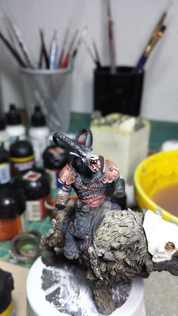
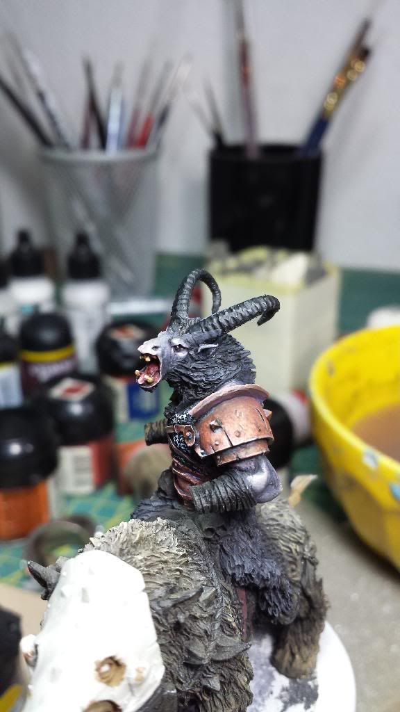
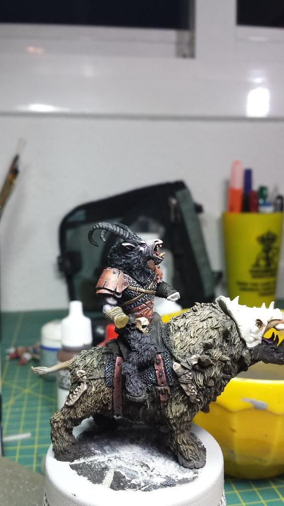
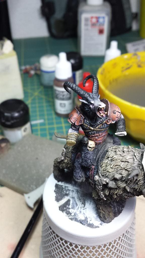
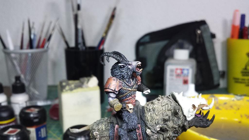
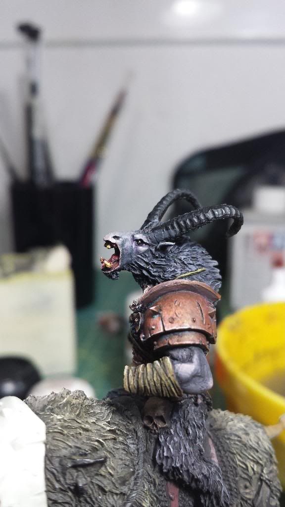
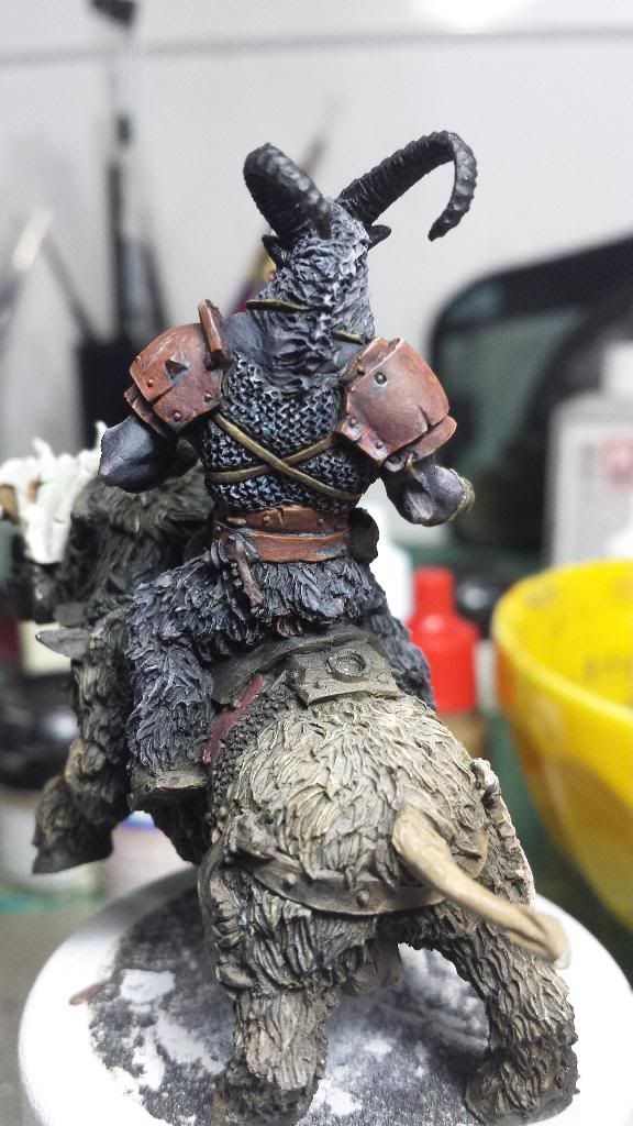
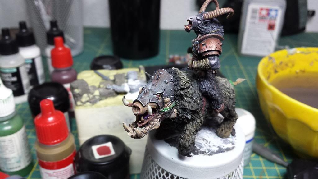
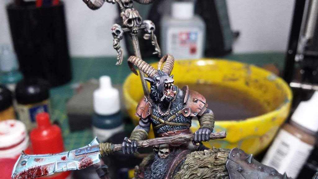
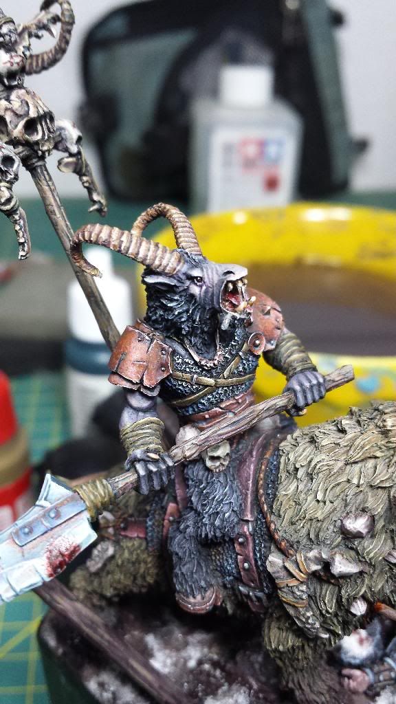
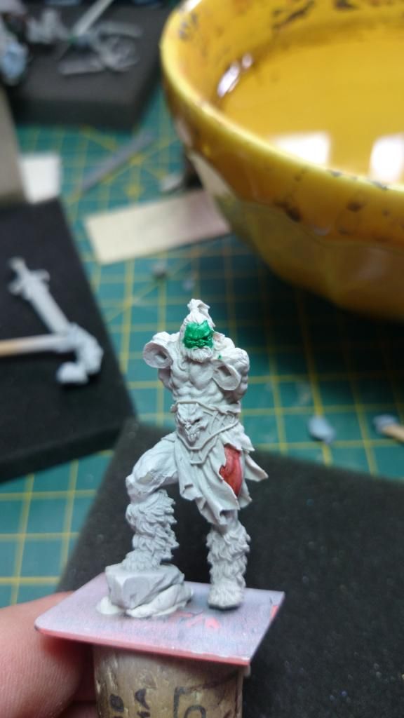
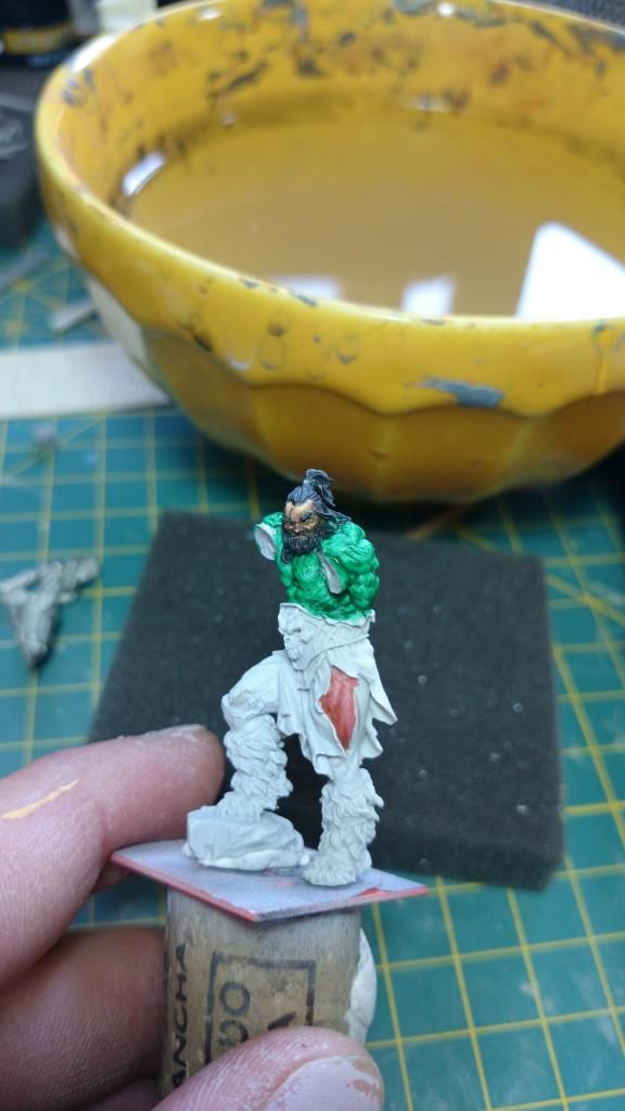
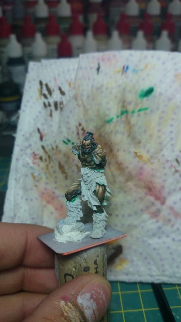
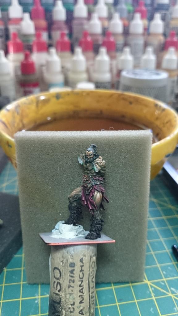
Here you have the advances on the beastman.
I have worked the bronzes, both shoulder protections and belt, and I think both are finished. Now I see that chest leather straps have a very similar color (and it's not my best paint), so I have to repaint it.
I also worked in the chain mail using celestial, blue and purple tones to give more vividness. What do you think?
Many thanks.
Adiós.
I have worked the bronzes, both shoulder protections and belt, and I think both are finished. Now I see that chest leather straps have a very similar color (and it's not my best paint), so I have to repaint it.
I also worked in the chain mail using celestial, blue and purple tones to give more vividness. What do you think?


Many thanks.
Adiós.

Re: Aniku's WIPs
That looks like a very ambitious project. Don't really have any advice for you but I can't wait to see how it turns out 
Beastman looks good but the chest straps do need to be a different colour, they are reinforcing what Andy S said, that the aged metal plates look like leather, since they are the same colour. Maybe a more red brown rather than orange brown. Other than that, looking greate.
Beastman looks good but the chest straps do need to be a different colour, they are reinforcing what Andy S said, that the aged metal plates look like leather, since they are the same colour. Maybe a more red brown rather than orange brown. Other than that, looking greate.
As I always say. At the end of the day.................it goes dark
Re: Aniku's WIPs
Yep, as soon as I get some free time Im going to repaint the chest straps. Maybe something like graveyard earth with some ice yellow to contrast with the chain mail and be very different to the shoulder protection. Red brown is the other option but maybe too warm to the winter scheme I'm using in. Let me see.
Thank you.
Adiós!
Thank you.
Adiós!
Re: Aniku's WIPs
Hi Aniku,
I really like this so far. For the fur on the Carrowhek cloak I first put down very wet paint and wet blended these together. Light on the outside and a dark stripe going through the middle. Doesn't have to be perfect just enough to get the background. Then I shade with thinned down gw glazes, for grey I shade with dark brown for a dirty feel. This will give more depth to the fur. Then I shade around specific patches of fur, the bits where there are a couple of strands together. Then I highlight, this is normally done with the edge of a brush taking the overall universal light into account eg brighter highlights on the shoulders then in the recesses.
Not sure f this helps, I'll try and post a picture when I get home as explaining it isn't all that easy.
Re: Aniku's WIPs
It helps a lot!!!
If you post de pics that would be great!!
Many thanks.
Adiós!
If you post de pics that would be great!!
Many thanks.
Adiós!
Re: Aniku's WIPs
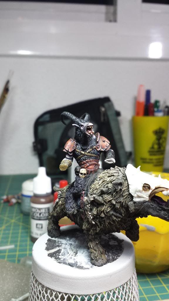
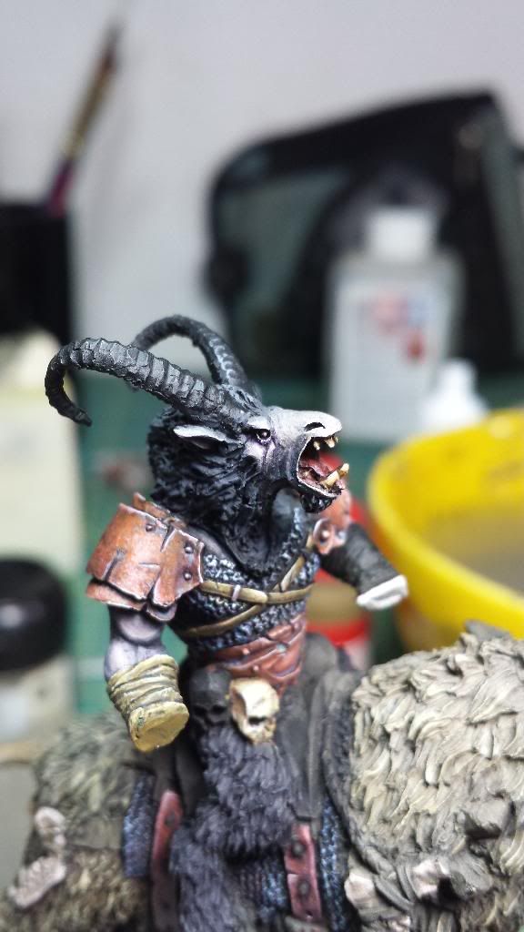
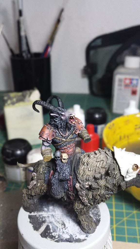
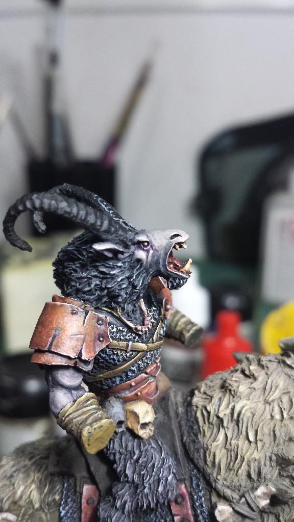
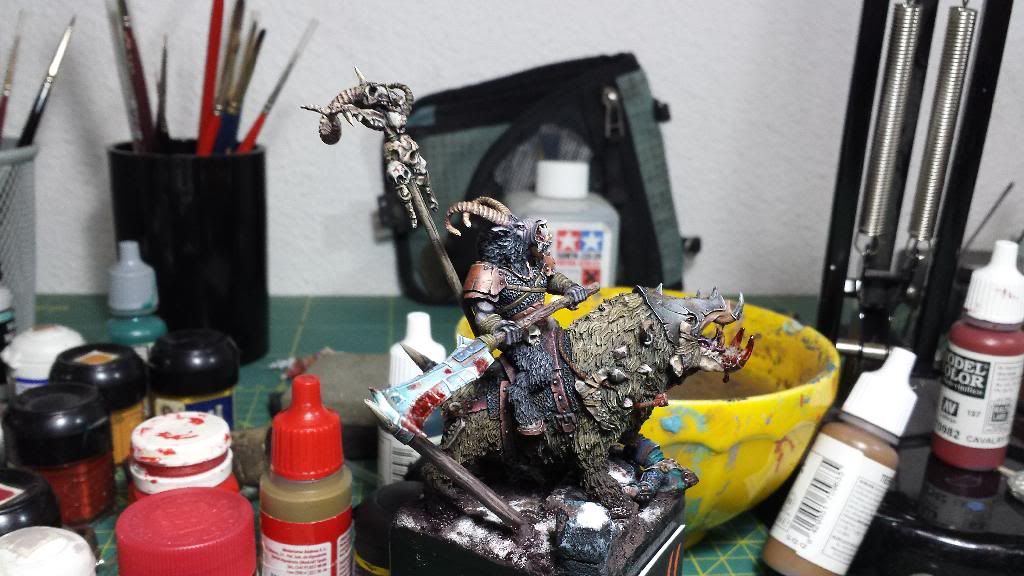
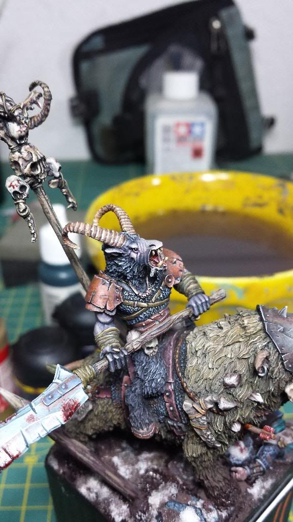
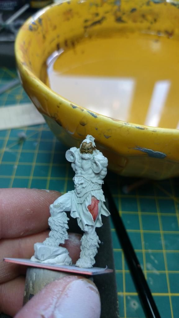
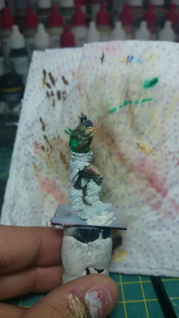
New advances on the beastman.
I have not had much time so I have dedicated to little details. I've become to work with the face (and I think that it continues to improve), I have repainted the leather straps on the chest and also have begun with the right arm, I have forced more light and shade on the shoulders protections, and I have begun one of the skulls (although I am not convinced by the result).
Pics:
And some details:
Today I'll try to find time to finish the skulls
Many thanks.
Adiós!
I have not had much time so I have dedicated to little details. I've become to work with the face (and I think that it continues to improve), I have repainted the leather straps on the chest and also have begun with the right arm, I have forced more light and shade on the shoulders protections, and I have begun one of the skulls (although I am not convinced by the result).
Pics:


And some details:


Today I'll try to find time to finish the skulls
Many thanks.
Adiós!
Re: Aniku's WIPs
Hi,
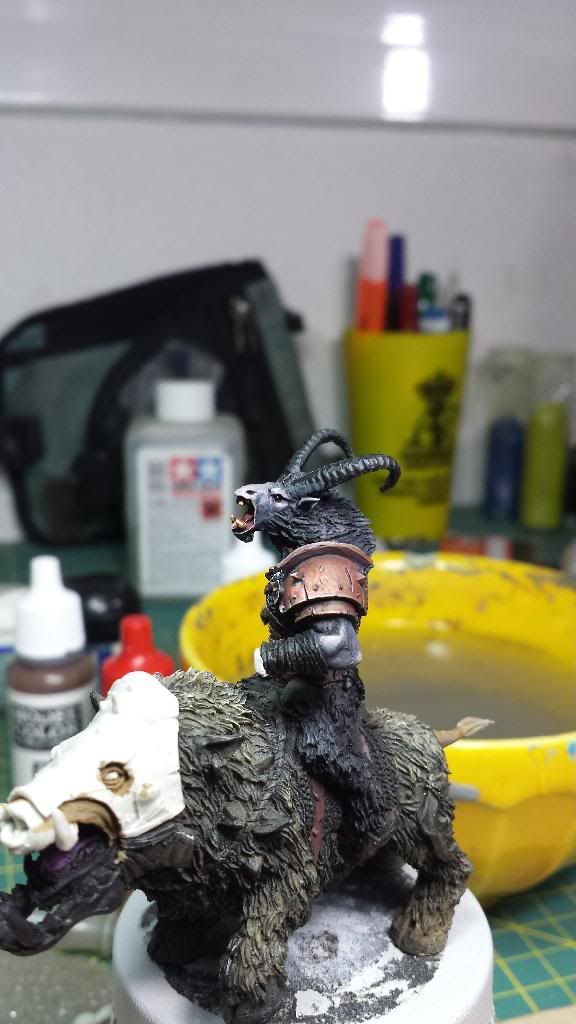
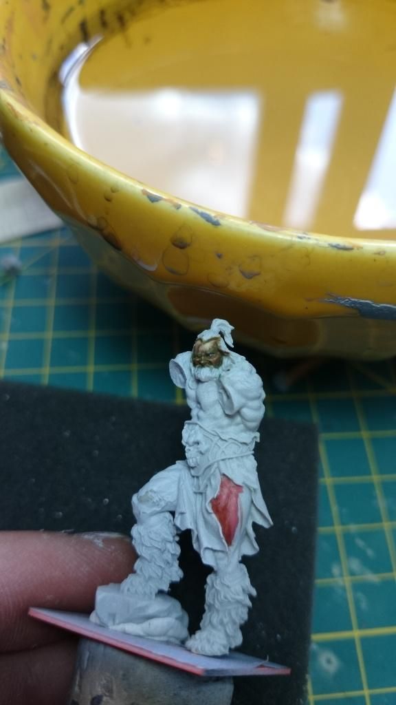
Just a couple of pics to show you the begining of the fur (more evident on the neck)...
By the way, it is very boring to paint fur...
I'm not quite sure with the result, What do you think? Any indication that could be helpful?
Many thanks.
Adiós!!
Just a couple of pics to show you the begining of the fur (more evident on the neck)...
By the way, it is very boring to paint fur...


I'm not quite sure with the result, What do you think? Any indication that could be helpful?
Many thanks.
Adiós!!
Re: Aniku's WIPs
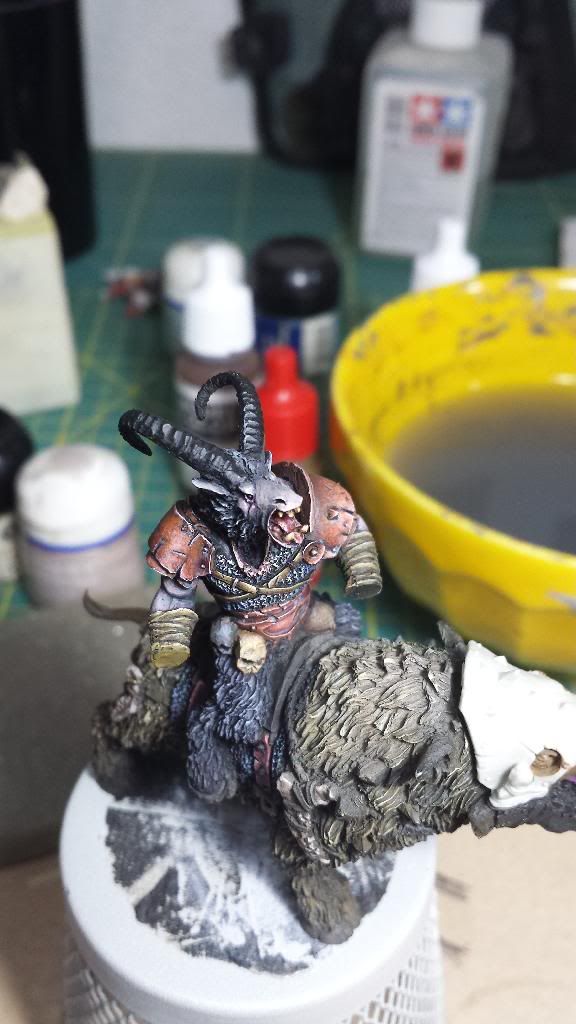
Hi,
I have been working on the fur and the leathers. But I have touched all around the miniature. Now I'm not quite sure with the left side of the face (the dark side) because I have the sensation that it is a little bit plane now.
8 pics todays to show you the situation in detail:
General pics:
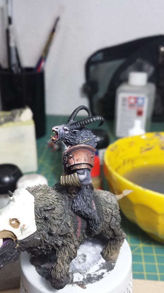
Face:
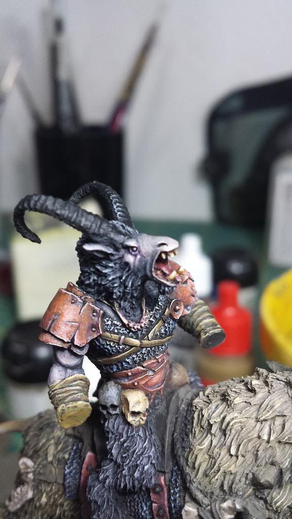
Detail and back:
Many thanks.
Adiós!!
I have been working on the fur and the leathers. But I have touched all around the miniature. Now I'm not quite sure with the left side of the face (the dark side) because I have the sensation that it is a little bit plane now.
8 pics todays to show you the situation in detail:
General pics:


Face:


Detail and back:


Many thanks.
Adiós!!
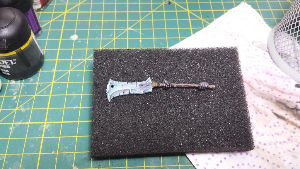
Re: Aniku's WIPs
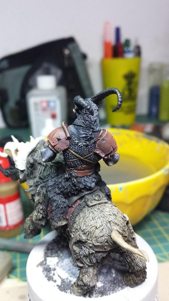
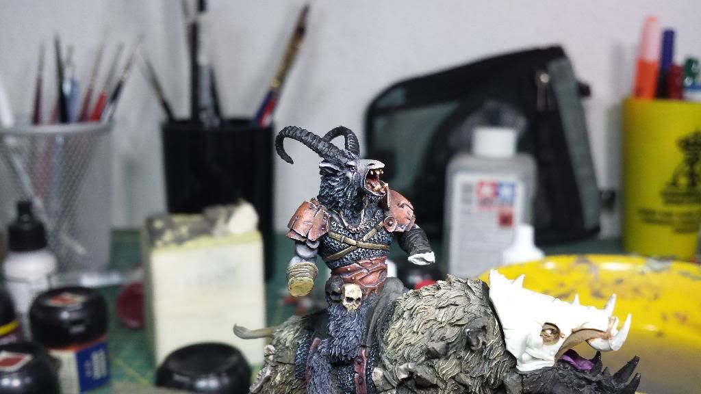
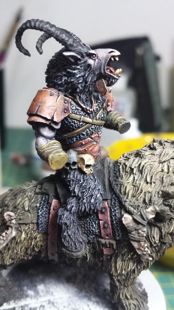
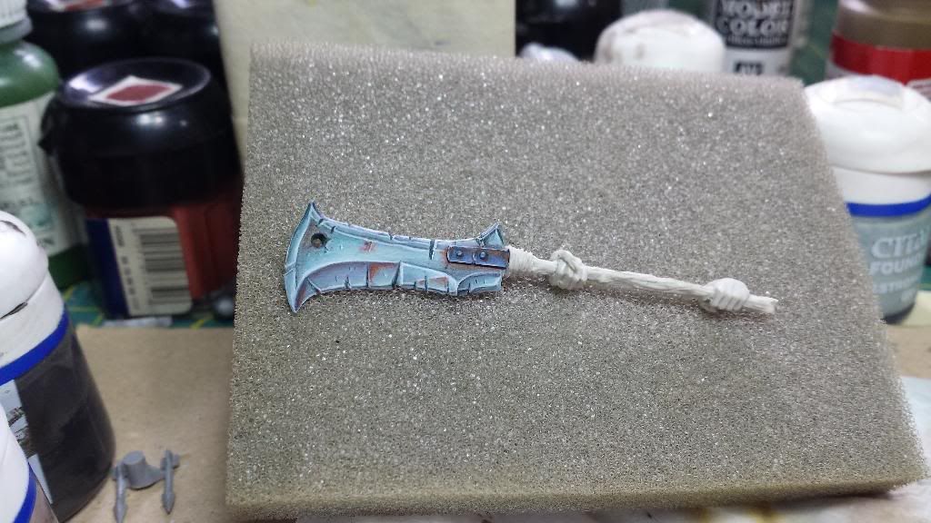
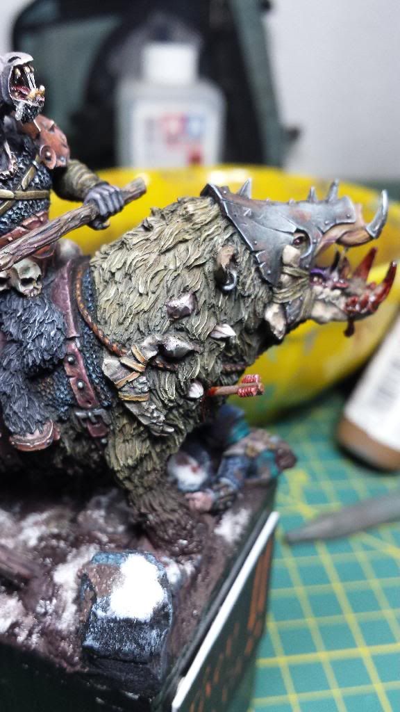
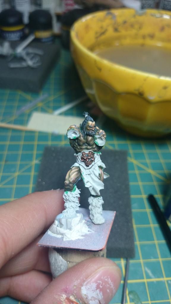
After a break here you have some new advances:
As usual I have worked on everything but the novelty is that I've painted the horns and the weapon. Probably I have not finished to paint them.
Pics:
Weapon:
Weapon:
The beastman with the weapon
Hope you like it.
Adiós!!
As usual I have worked on everything but the novelty is that I've painted the horns and the weapon. Probably I have not finished to paint them.
Pics:
Weapon:

Weapon:

The beastman with the weapon


Hope you like it.
Adiós!!
Re: Aniku's WIPs
Great looking nmm on that axe blade. Very envious of your skill.
As I always say. At the end of the day.................it goes dark
-
Malachi B.
- Posts: 67
- Joined: Fri Jan 17, 2014 4:36 pm
Re: Aniku's WIPs
Thumbs up!
Re: Aniku's WIPs
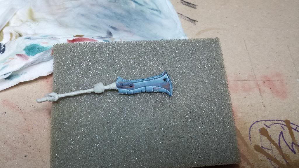
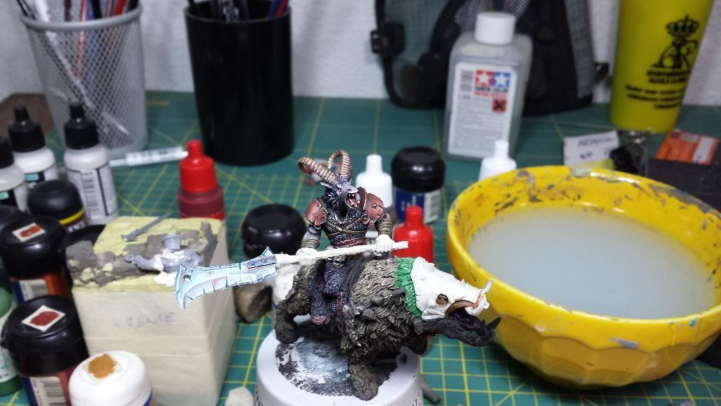
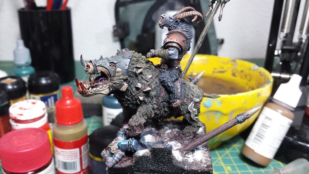
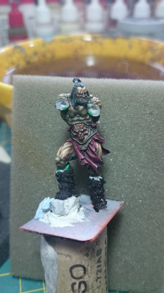
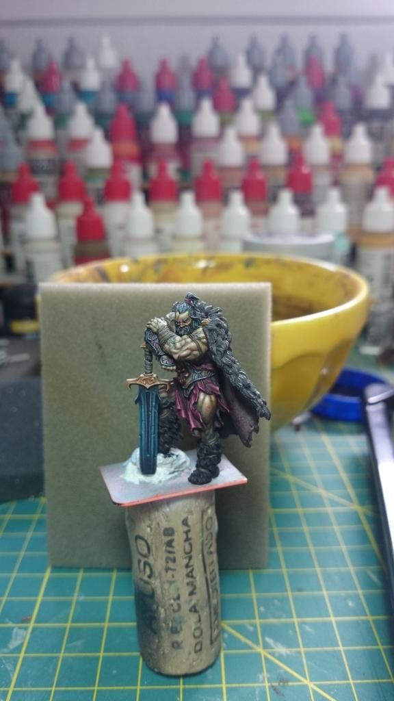
Come up with new advances...
I have corrected things in the weapon so it fits better with the ambient light and I have advanced with the head of the boar.
The weapon. I have repainted some shadows and lights and aldos the hands to get a purple grey tone that fit better with the arms. Still needs blood and mug.
The head of the boar. Head protection is made with a stippling with less water than usual to get the feeling of being a rough metal and unpolished; I've also played with several tones to give more chromatic vividness. The jaw is worked like a bone and then added shades of blue, green and some brown. Still needs blood and mug.
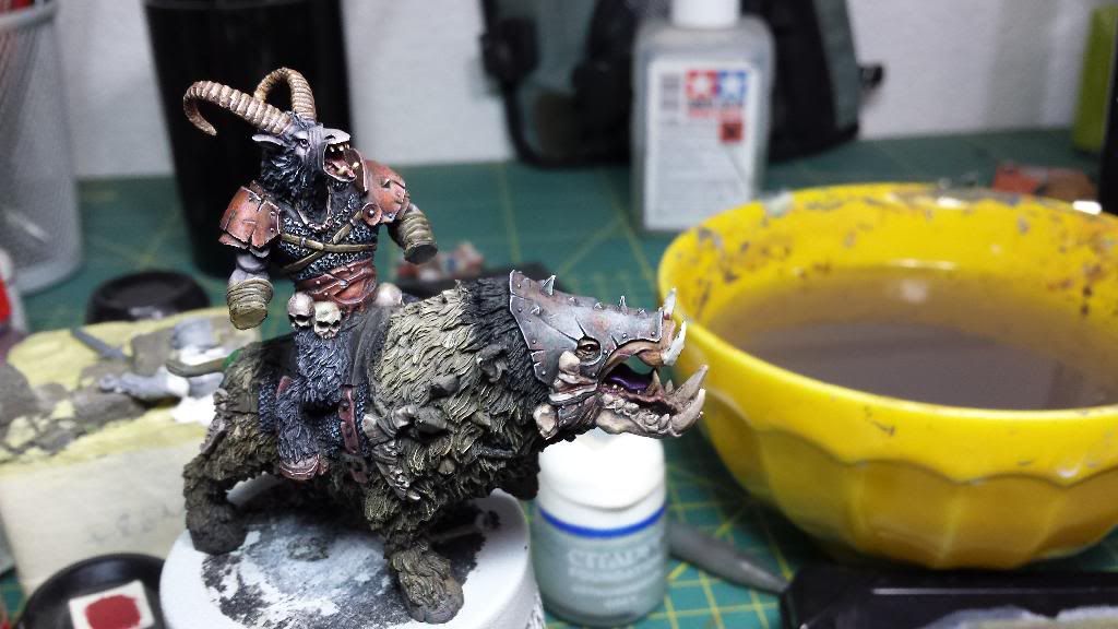
Hope you like it.
Many thanks to all of you for your comments and support.
Adiós!!
I have corrected things in the weapon so it fits better with the ambient light and I have advanced with the head of the boar.
The weapon. I have repainted some shadows and lights and aldos the hands to get a purple grey tone that fit better with the arms. Still needs blood and mug.

The head of the boar. Head protection is made with a stippling with less water than usual to get the feeling of being a rough metal and unpolished; I've also played with several tones to give more chromatic vividness. The jaw is worked like a bone and then added shades of blue, green and some brown. Still needs blood and mug.


Hope you like it.
Many thanks to all of you for your comments and support.
Adiós!!
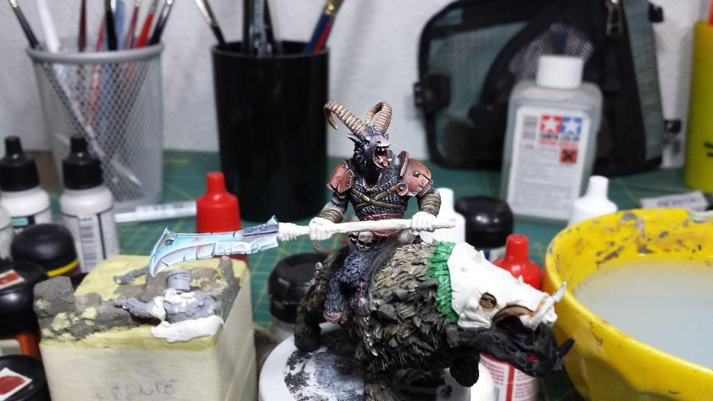
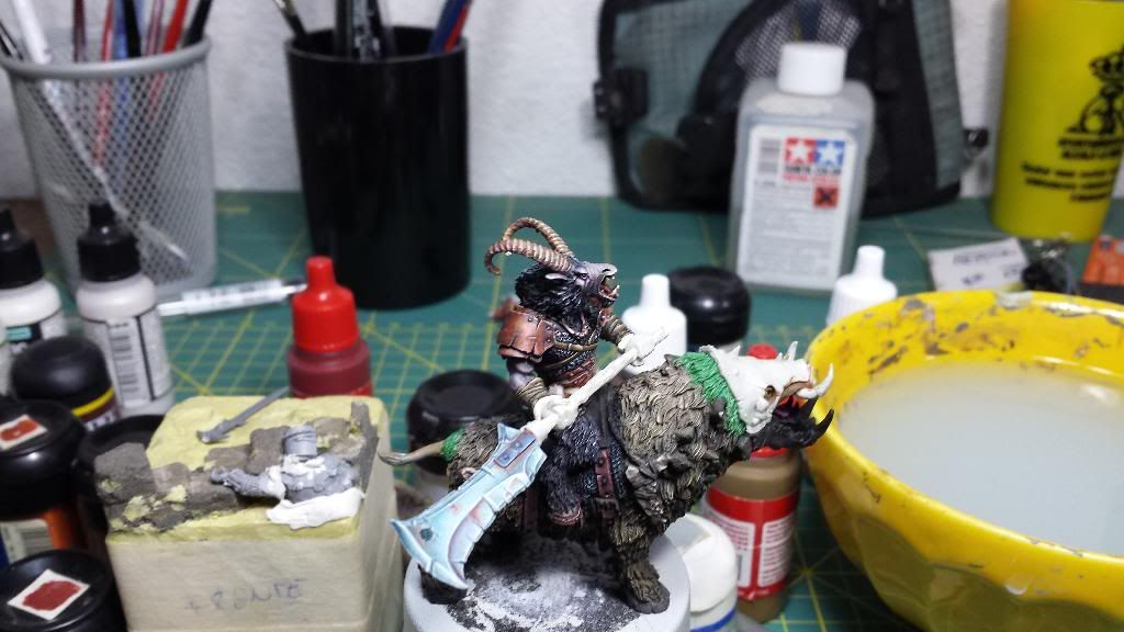
Re: Aniku's WIPs
The miniature is done!!!! or almost done!!! I have to correct some minor things...
Crap pics before I send the miniature to finished projects.
Details:
Many thanks.
Mariano.
Crap pics before I send the miniature to finished projects.


Details:


Many thanks.
Mariano.
-
Malachi B.
- Posts: 67
- Joined: Fri Jan 17, 2014 4:36 pm
Re: Aniku's WIPs
As i said very well done in particular Armor both on gabrax and on boar, his head armor is wondrefull! Maybe fur a little more various, but i cant say really, photos or light sure dont give justice.
Salute! Hail!
Salute! Hail!
-
devilution
- Posts: 8
- Joined: Tue Sep 24, 2013 9:40 am
Re: Aniku's WIPs
Awesome paint job ! Love the metal parts ! Really nice !!!
Re: Aniku's WIPs
Hi,
Long time has passed since I wrote here for the last time.
I the middle I had time to get marry, to has my honey moon travel and some other stuff.
So I'm back, but before I continue with the big diorama I want to recover sensations with a little project.
First, a little explanation:
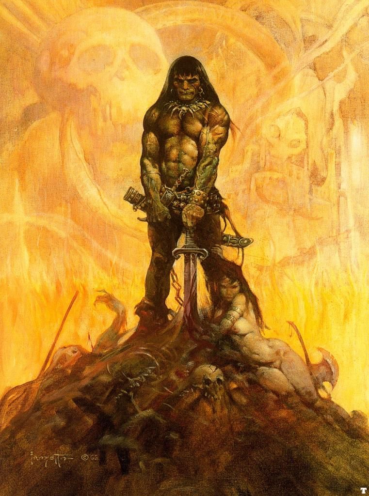
From the first time I had a Conan novel this kind of stories have enchanted me. You can not imagine how many books and comic-books I've got of the Robert E. Howard's character. And if anything has fascinated me it has been the illustrations made by Frank Fazzeta of him. Well, that is what I want to do with this project. Not only a tribute to Conan, but to all sword and sorcery stories and to the paintings of Frank Fazzeta-.
So as a model of painting I'm going to use this illustration and painting miniature based on the same.
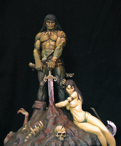
For the composition, I want to do something that evokes the covers of Conan, generally accompanied by a beautiful lady and dealing with the destination. So I started to work to see if it was able to achieve something like this...
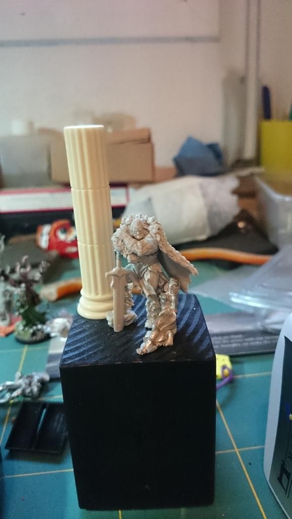
Here you have the development of the composition as a step by step. So you can see how it has been built.
And now we are going with the painting. If you are interested in something in particular you can ask me without any problems. I have the list of colors at home. In the afternoon I will edit the post and put it to you:
And a photo of the set in which I added a flight to the hair and the clothes of the slave so it fits with the layer and the cloth of the barbarian.
Thank you very much.
Long time has passed since I wrote here for the last time.
I the middle I had time to get marry, to has my honey moon travel and some other stuff.
So I'm back, but before I continue with the big diorama I want to recover sensations with a little project.
First, a little explanation:
From the first time I had a Conan novel this kind of stories have enchanted me. You can not imagine how many books and comic-books I've got of the Robert E. Howard's character. And if anything has fascinated me it has been the illustrations made by Frank Fazzeta of him. Well, that is what I want to do with this project. Not only a tribute to Conan, but to all sword and sorcery stories and to the paintings of Frank Fazzeta-.
So as a model of painting I'm going to use this illustration and painting miniature based on the same.


For the composition, I want to do something that evokes the covers of Conan, generally accompanied by a beautiful lady and dealing with the destination. So I started to work to see if it was able to achieve something like this...
Here you have the development of the composition as a step by step. So you can see how it has been built.


And now we are going with the painting. If you are interested in something in particular you can ask me without any problems. I have the list of colors at home. In the afternoon I will edit the post and put it to you:


And a photo of the set in which I added a flight to the hair and the clothes of the slave so it fits with the layer and the cloth of the barbarian.

Thank you very much.
-
darthmarsh
- Posts: 56
- Joined: Tue Aug 06, 2013 10:52 pm
Re: Aniku's WIPs
great work Aniku. It's already looking very good and it's very interesting to see the process behind your skin.
Re: Aniku's WIPs
HI,
Thank you Darthmash. By the way, it is the first time I painted the base green before painting the skin. I readed something similar in an article of Karaikal painting an orc head, he painted purple before he began to paint the green skin.
I have worked on the legs skin, 95% finish, I just want to add some minus tones. Quite happy with the left leg...
Many thanks,
Mariano.
Thank you Darthmash. By the way, it is the first time I painted the base green before painting the skin. I readed something similar in an article of Karaikal painting an orc head, he painted purple before he began to paint the green skin.
I have worked on the legs skin, 95% finish, I just want to add some minus tones. Quite happy with the left leg...


Many thanks,
Mariano.
Re: Aniku's WIPs
As usual. Awesome work. That skin looks brilliant. May have to try that technique.
As I always say. At the end of the day.................it goes dark
-
darthmarsh
- Posts: 56
- Joined: Tue Aug 06, 2013 10:52 pm
Re: Aniku's WIPs
top marks. This really is turning into one of the best barbarian dudes I've seen
Re: Aniku's WIPs
Hi,
darthmarsh » Wed Jul 23, 2014 11:31 pm
top marks. This really is turning into one of the best barbarian dudes I've seen ----------------------------- Are you trying to seduce me???
AndyP, I have always thought that the more painting technics you test, the better for your painting skills.
Thank you very much!!
-
darthmarsh
- Posts: 56
- Joined: Tue Aug 06, 2013 10:52 pm
Re: Aniku's WIPs
hahaha no but is it working?
Re: Aniku's WIPs
Jajajajajaja, not at all Darthmash, not at all
Let's go with some advances:
I've tweaked the face a little bit (eyebrow). On the right leg I painted smoother transitions between the colors and added some tones. Some minus work on the hair. I added more light on the leather belt and worked a little bit more the NMM.
I have given many cane to the apron and it is practically finished. And we have the base of boots color.
This weekend I'm out but hopefully by the end of the next week the barbarian dude will be painted. Being realistic I think I will need 3 or 4 extra days to finish (apart of the week).
Many thanks,
Mariano "Aniku".
Let's go with some advances:
I've tweaked the face a little bit (eyebrow). On the right leg I painted smoother transitions between the colors and added some tones. Some minus work on the hair. I added more light on the leather belt and worked a little bit more the NMM.
I have given many cane to the apron and it is practically finished. And we have the base of boots color.

This weekend I'm out but hopefully by the end of the next week the barbarian dude will be painted. Being realistic I think I will need 3 or 4 extra days to finish (apart of the week).
Many thanks,
Mariano "Aniku".
Re: Aniku's WIPs
Hi!
Some new advances. Not too much but it has been impossible due to the job....
I'm going to stop painting the body of the barbarian because it's time to begin the arms.
In the pic you can see finishd the boots and the apron.
Many thanks,
Mariano.
Some new advances. Not too much but it has been impossible due to the job....
I'm going to stop painting the body of the barbarian because it's time to begin the arms.
In the pic you can see finishd the boots and the apron.

Many thanks,
Mariano.
Re: Aniku's WIPs
Looking great.
Re: Aniku's WIPs
Hi!!
Great painting weekend (my son is with his grand parents). Until some final touches before I put it to the base, I'm going to leave it as finished.
Hope you like it.
Now, time for the slave...
Many thanks,,
Mariano.
Great painting weekend (my son is with his grand parents). Until some final touches before I put it to the base, I'm going to leave it as finished.

Hope you like it.
Now, time for the slave...
Many thanks,,
Mariano.
Last edited by Aniku on Fri Aug 08, 2014 11:13 am, edited 1 time in total.
-
deadlydeceiver

- Posts: 175
- Joined: Tue Feb 26, 2013 12:45 am
- Location: Stuttgart, Germany
Re: Aniku's WIPs
Wow Mariano, you're a great painter!
DD
DD
Come visit my blog about Mierce, Kingdom Death and more
http://sendtheeighth.blogspot.de/
http://sendtheeighth.blogspot.de/
Re: Aniku's WIPs
Hi,
Let's keep going forward with the scene.
But first of all, Many thanks for the comments.
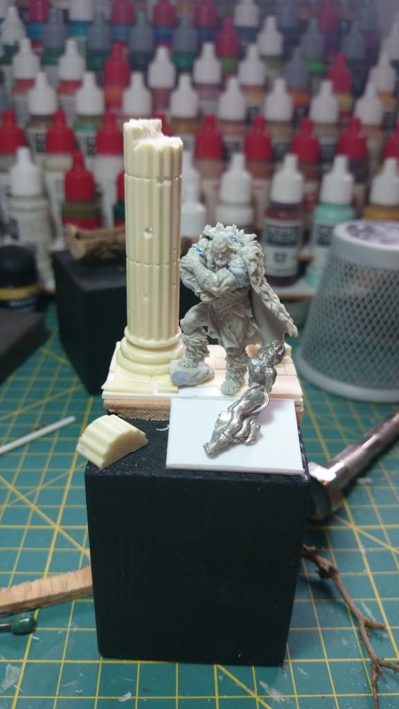
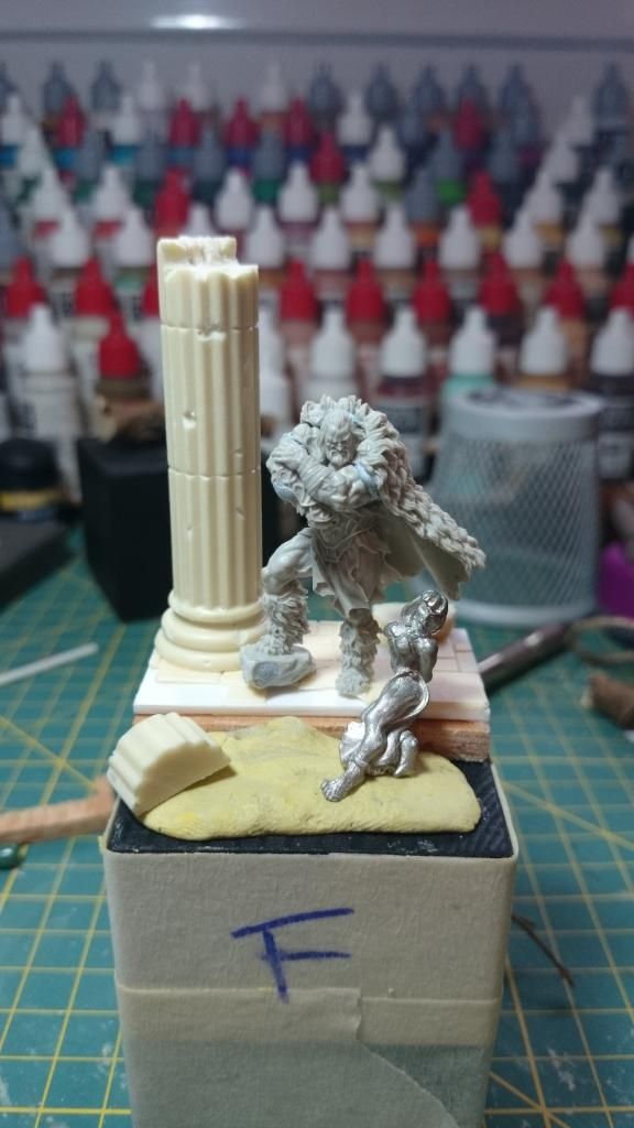
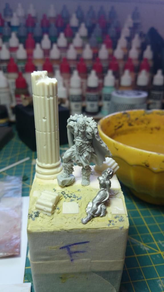
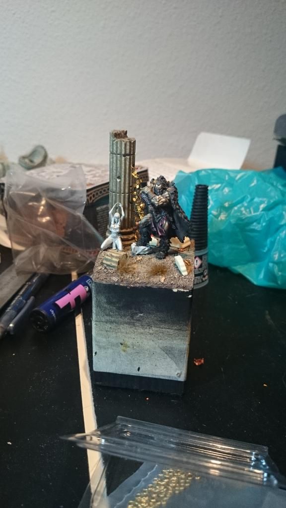
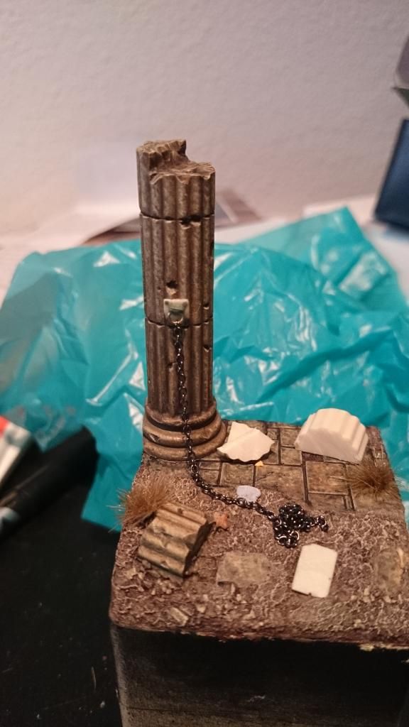
Advances on the base
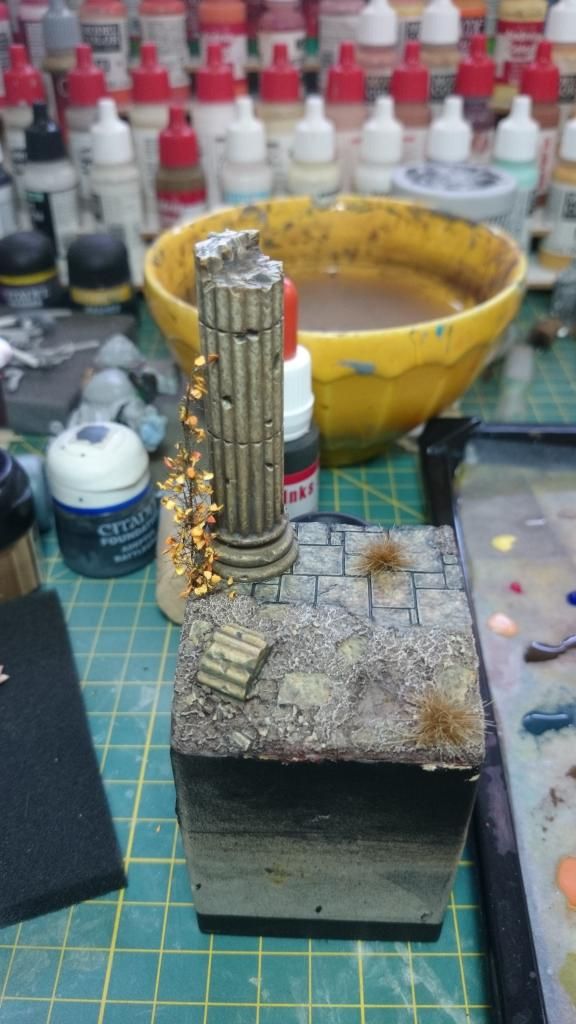
Here with all the elements
Advances on the slave
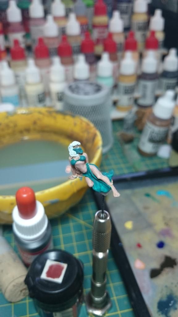
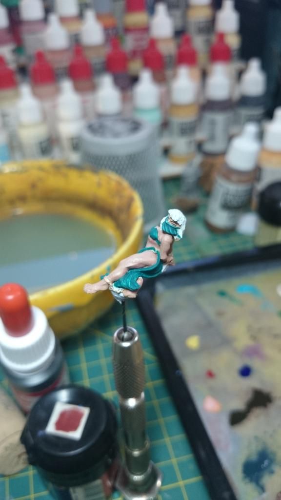
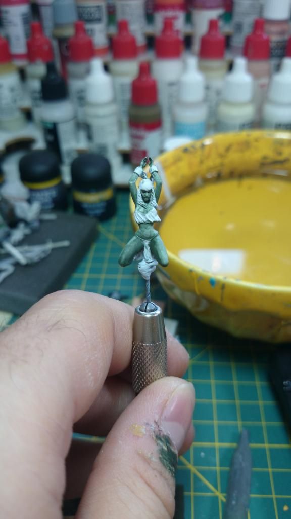
This miniature is a real hell so my option was to eliminate all possibles problematic points. Como es taaaaan jodida esa mini I chose to cover her face with a veil and ease abdominal and soften the sternum... I am not able to take advantage of the miniature of the slave.
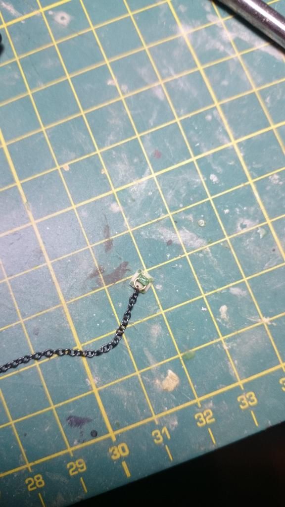
Between stress and blockages because of the slave I already rode the iron chain to join column and slave (google translator)
And yesterday night I decided to change everything because there is no way with the slave. All my admiration to whom has finished the slave and felt satisfied... So we are going to replace it, (Arrgggg). I have two options of composition:
First one with the slave next to the column, chained by the wrists. I moved the barbarian to the front to improve the composition and to give him more presence.
Second one with the slave in the right/front. The connecting chain between the slave and the column will be torn apart by the sword of the barbarian.
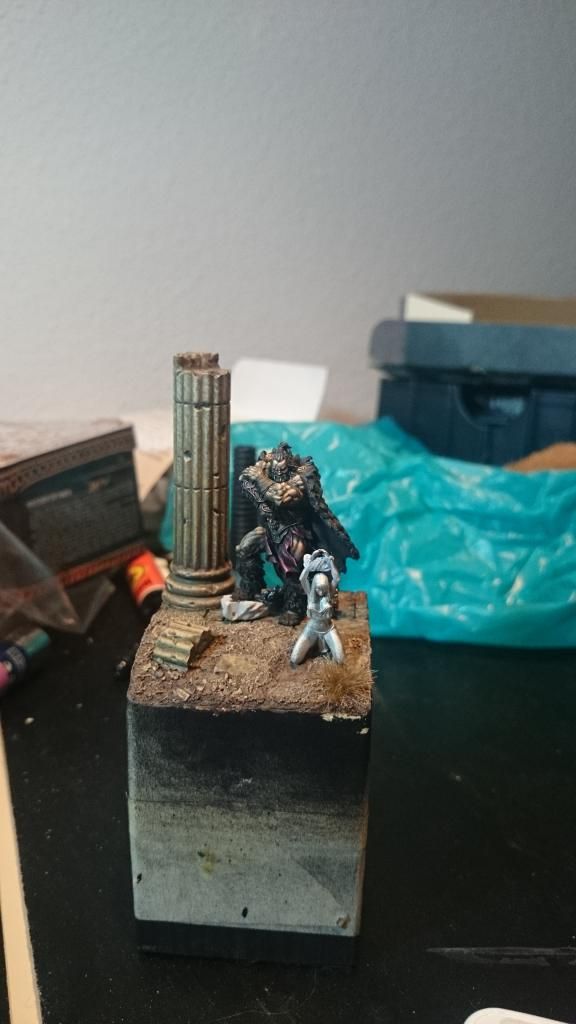
Wich one do you like the most?
Many thanks,
Mariano.
Let's keep going forward with the scene.
But first of all, Many thanks for the comments.
Advances on the base

Here with all the elements

Advances on the slave


This miniature is a real hell so my option was to eliminate all possibles problematic points. Como es taaaaan jodida esa mini I chose to cover her face with a veil and ease abdominal and soften the sternum... I am not able to take advantage of the miniature of the slave.
Between stress and blockages because of the slave I already rode the iron chain to join column and slave (google translator)

And yesterday night I decided to change everything because there is no way with the slave. All my admiration to whom has finished the slave and felt satisfied... So we are going to replace it, (Arrgggg). I have two options of composition:
First one with the slave next to the column, chained by the wrists. I moved the barbarian to the front to improve the composition and to give him more presence.

Second one with the slave in the right/front. The connecting chain between the slave and the column will be torn apart by the sword of the barbarian.

Wich one do you like the most?
Many thanks,
Mariano.
Re: Aniku's WIPs
Looking good overall. Excellent work. Slave chained to column, for me.
As I always say. At the end of the day.................it goes dark

Re: Aniku's WIPs
I vote for your first choice as well, but would change the positioning of both models in relation to each other. That´s because right now they don´t interact with each other, they even avoid looking at each other. It doesn´t feel like a realistic scenery at the moment - but that are just my two cents! Your painting skills are awesome for which I´m a little bit envy of
Cheers
Jan
Cheers
Jan
Re: Aniku's WIPs
I'm not sure. If I were to pick either of the choices, the first one would look better. But I think the entire scene would look a bit odd with him just standing there resting on his weapon.
-
darthmarsh
- Posts: 56
- Joined: Tue Aug 06, 2013 10:52 pm
Re: Aniku's WIPs
Chained to the column for me as well buddy. He turned out incredibly by the way, you really did knock this one out of the ball park! What did you make the plant out of? it looks fantastic and I'd really appreciate a tutorial
Tim
Tim
Re: Aniku's WIPs
Hi, back again...
Fisrt thing, the final decission. Although it was not my favorite, the one selected was the second! Yes, the other fits better in the column however, the second one I think give more game on the history and the composition
A user of coolminiornot forum presented the problem on the composition of the option 1 graphically very very simple to understand. Showing the lack of synergy between the minis and the free space on the front.
[img325]http://www.coolminiornot.com/forums/attachment.php?attachmentid=29967&d=1407501051[/img325]
On the second one you can see how the composition is more balanced. And I can tell a story throught that composition. The slave seems praying to their gods for the release that the barbarian has provided (remains to be seen what gives the barbarian to her later...)
[img325]http://www.coolminiornot.com/forums/attachment.php?attachmentid=29966&d=1407500808[/img325]
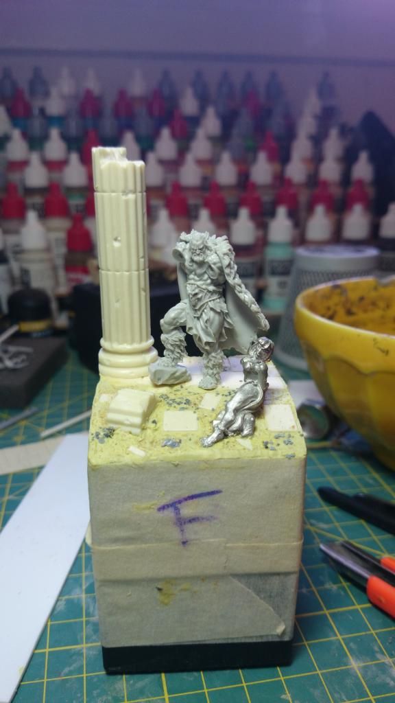
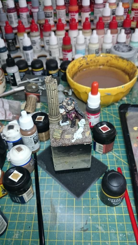
Well, we have the composition. Let's see how looks like actually.
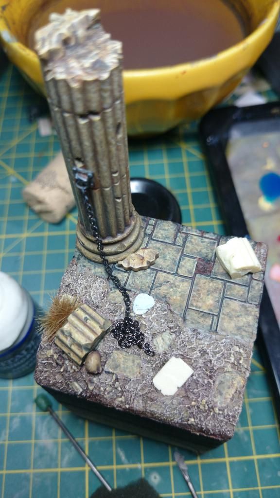
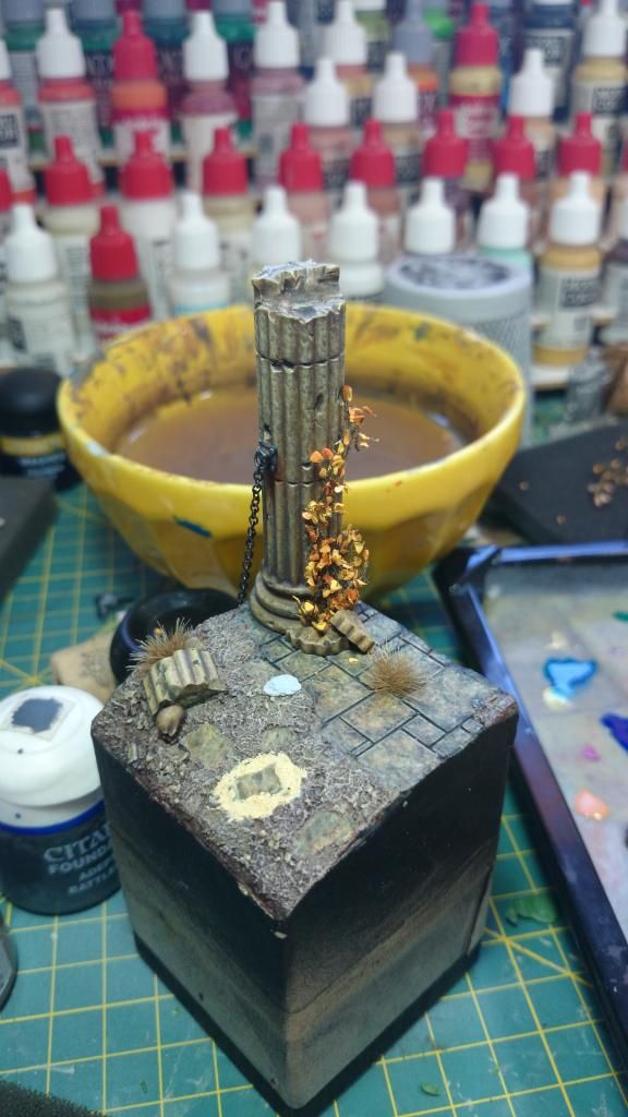
As you can see I added a skull, some more rubble and there will be a surprise once all the elements are glued to the base.
And now the slave. Yep, the old one fit better to the base but the sculpture of the new one make it much more beautiful than the old one. It has a more real looks.
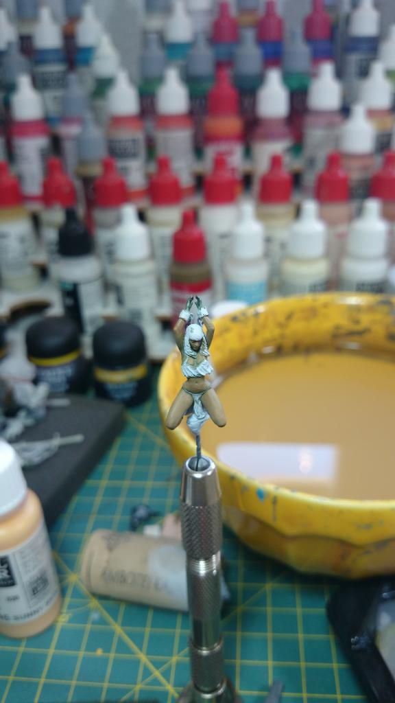
First, the color pre-base, This time with a less intense green because women have more fine features.
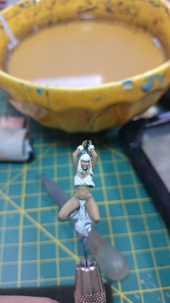
And now the real color base
Mark lights on face and arms.
The mistake of the afternoon. God, horrible red hair indeed
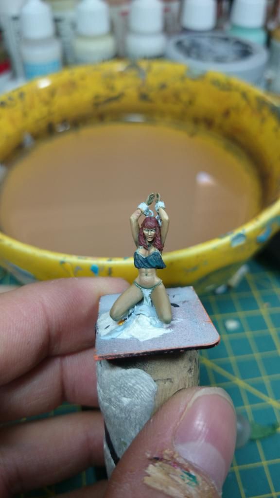
And the pics as it is now. The skin is practically over maybe it needs some more tones, and I have already advanced with the top, repainting the hair...
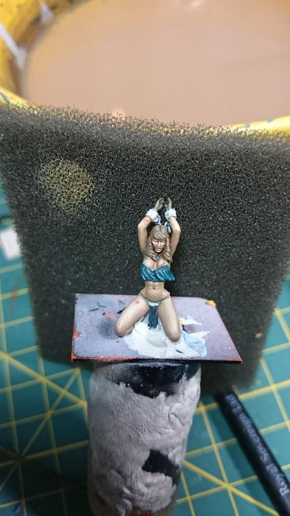
Do you like her and the base?
Darthmash, this is going to be the easier tutorial in my life. Buy from Mininatur Weed tufts. SILHOUETTE 725-34S, glued to the column. It's over... Well, a just painted the stem with brown chocolate for a more realistic finish. If ypou need more info about how to glue, or anything just ask me here or by PM.
Many thanks,
Mariano.
Fisrt thing, the final decission. Although it was not my favorite, the one selected was the second! Yes, the other fits better in the column however, the second one I think give more game on the history and the composition
A user of coolminiornot forum presented the problem on the composition of the option 1 graphically very very simple to understand. Showing the lack of synergy between the minis and the free space on the front.
[img325]http://www.coolminiornot.com/forums/attachment.php?attachmentid=29967&d=1407501051[/img325]
On the second one you can see how the composition is more balanced. And I can tell a story throught that composition. The slave seems praying to their gods for the release that the barbarian has provided (remains to be seen what gives the barbarian to her later...)
[img325]http://www.coolminiornot.com/forums/attachment.php?attachmentid=29966&d=1407500808[/img325]
Well, we have the composition. Let's see how looks like actually.


As you can see I added a skull, some more rubble and there will be a surprise once all the elements are glued to the base.
And now the slave. Yep, the old one fit better to the base but the sculpture of the new one make it much more beautiful than the old one. It has a more real looks.
First, the color pre-base, This time with a less intense green because women have more fine features.

And now the real color base

Mark lights on face and arms.

The mistake of the afternoon. God, horrible red hair indeed

And the pics as it is now. The skin is practically over maybe it needs some more tones, and I have already advanced with the top, repainting the hair...

Do you like her and the base?
Darthmash, this is going to be the easier tutorial in my life. Buy from Mininatur Weed tufts. SILHOUETTE 725-34S, glued to the column. It's over... Well, a just painted the stem with brown chocolate for a more realistic finish. If ypou need more info about how to glue, or anything just ask me here or by PM.
Many thanks,
Mariano.
Re: Aniku's WIPs
Good stuff. I agree with the positioning.
Re: Aniku's WIPs
Hello
I have already finished the miniature. As always, I will check the paint in a few days (it's good to disconnect) and maybe I will add points of extra light and correct some mistakes.
At the end I had to change the story a little bit. Having to use a different slave miniature has disrupted some ideas but, and thanks to the idea of a companion painting, I think the idea is better closed now.
The truth is that I am not at all satisfied with the scene and the painted, but after 5 months without touching a brush cannot be expected otherwise. Anyway, with the barbarian I am more than satisfied, I think the result has been very good, at least for my painting level, but all the credit is for the miniature which seems that it paints by itslef.
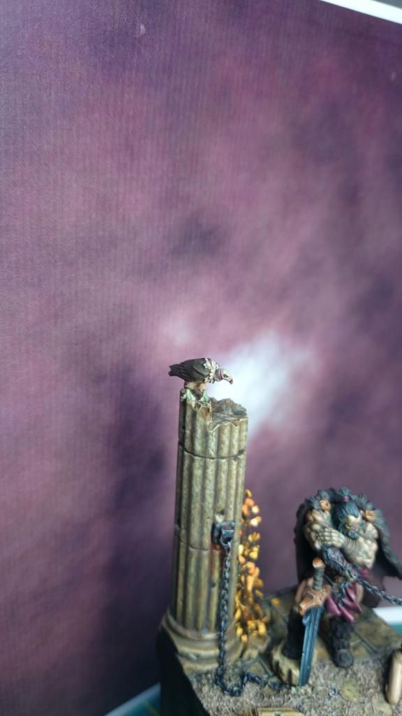
Well, here you have the miniature so you can see the change:
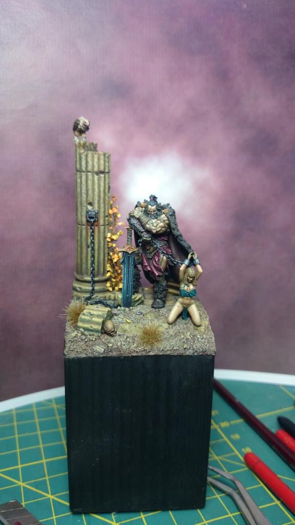
and a detail of the vulture:
As you can see, the barbarian don't poses with a freed slave, now he is resting after collecting his new acquisition. Yes, it is a little macho man but with the position of the slave I have not other option than bring the chain to the hand of the barbarian. With the change I haven't got so clear the name, I'm between Weird Tales and The Hyborian Age; what you like most?
This week I hope to have better pics.
Thank you all for your comments!
Thanks a lot
I have already finished the miniature. As always, I will check the paint in a few days (it's good to disconnect) and maybe I will add points of extra light and correct some mistakes.
At the end I had to change the story a little bit. Having to use a different slave miniature has disrupted some ideas but, and thanks to the idea of a companion painting, I think the idea is better closed now.
The truth is that I am not at all satisfied with the scene and the painted, but after 5 months without touching a brush cannot be expected otherwise. Anyway, with the barbarian I am more than satisfied, I think the result has been very good, at least for my painting level, but all the credit is for the miniature which seems that it paints by itslef.
Well, here you have the miniature so you can see the change:

and a detail of the vulture:

As you can see, the barbarian don't poses with a freed slave, now he is resting after collecting his new acquisition. Yes, it is a little macho man but with the position of the slave I have not other option than bring the chain to the hand of the barbarian. With the change I haven't got so clear the name, I'm between Weird Tales and The Hyborian Age; what you like most?
This week I hope to have better pics.
Thank you all for your comments!
Thanks a lot
Re: Aniku's WIPs
These are simply awesome, keep up the good work.
Who is online
Users browsing this forum: No registered users and 2 guests