I'm working on a little diorama with a couple of dwarfs. I have called it "The painter and the Noble". Now I'm finishing the scenerio but I accept any advices o sugerence.
Here you have some pic.
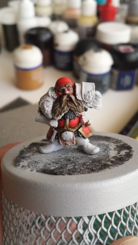
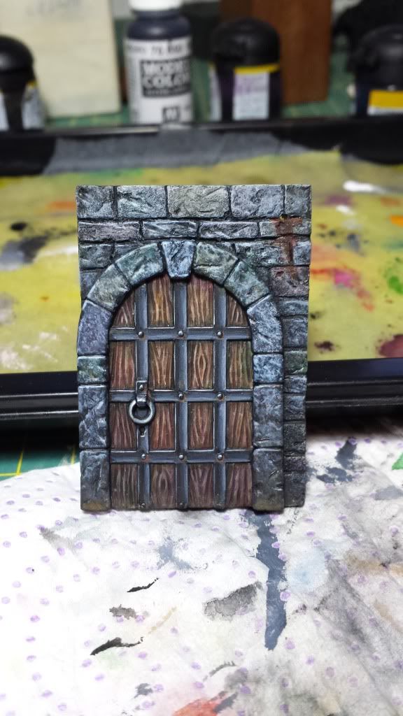
The concept:

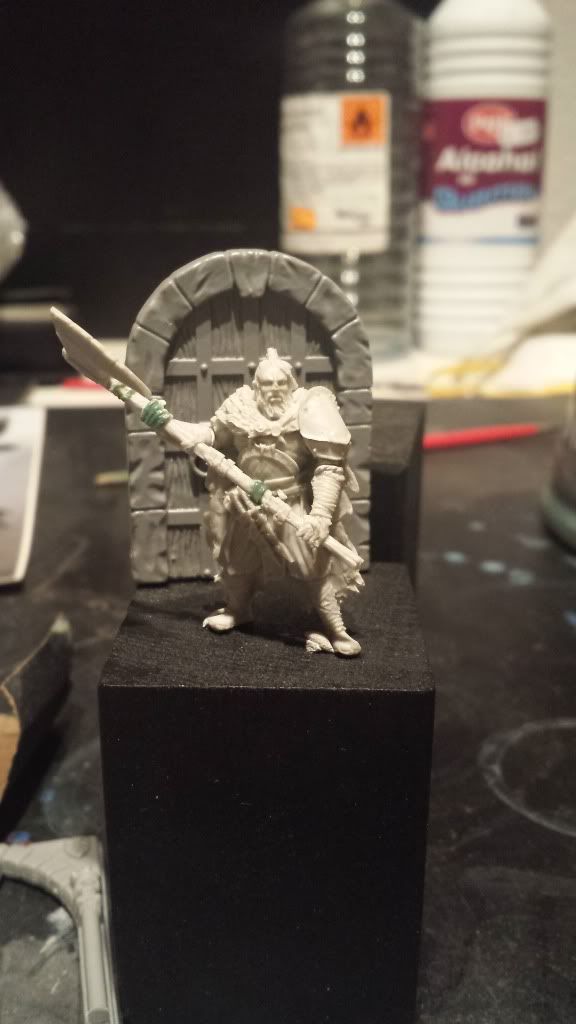
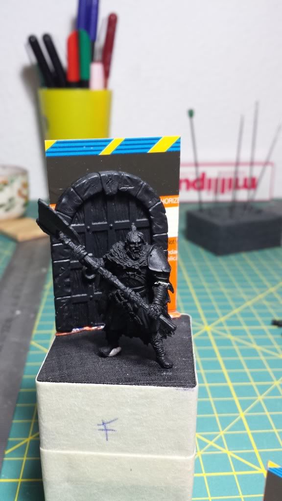
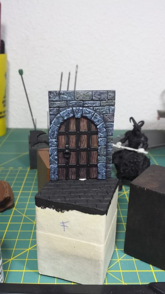
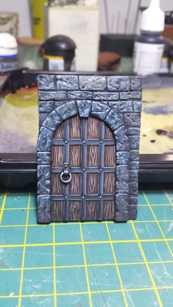
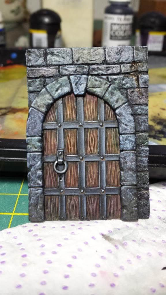
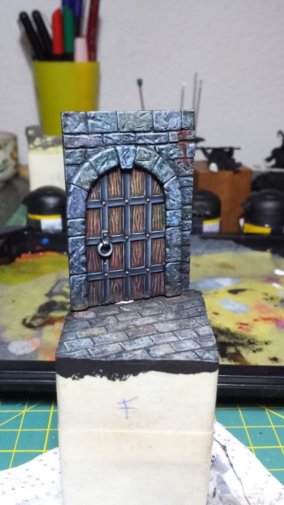
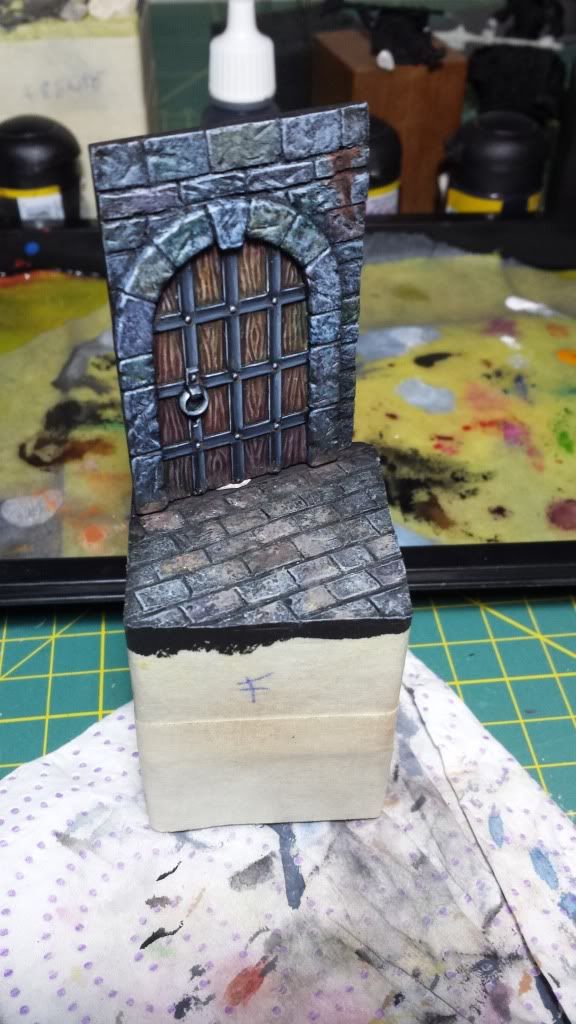
Some advances:


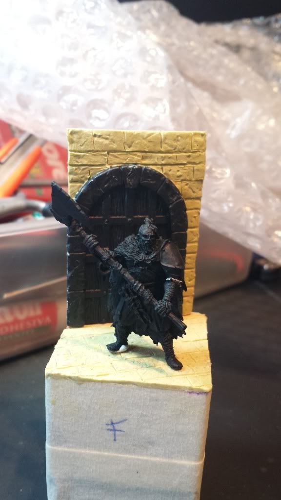
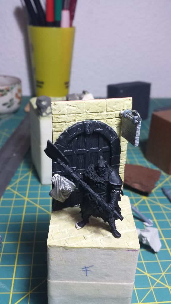
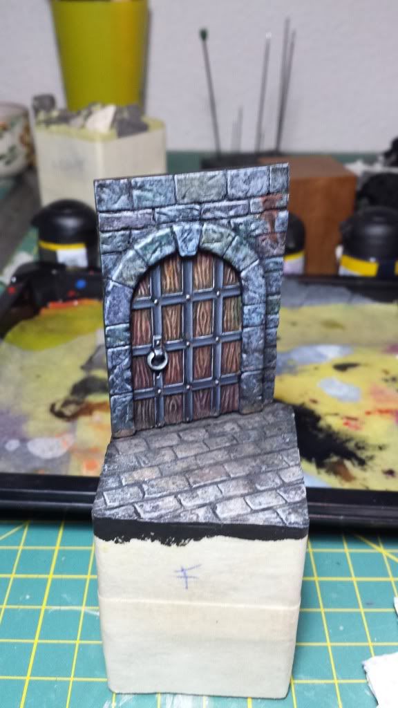
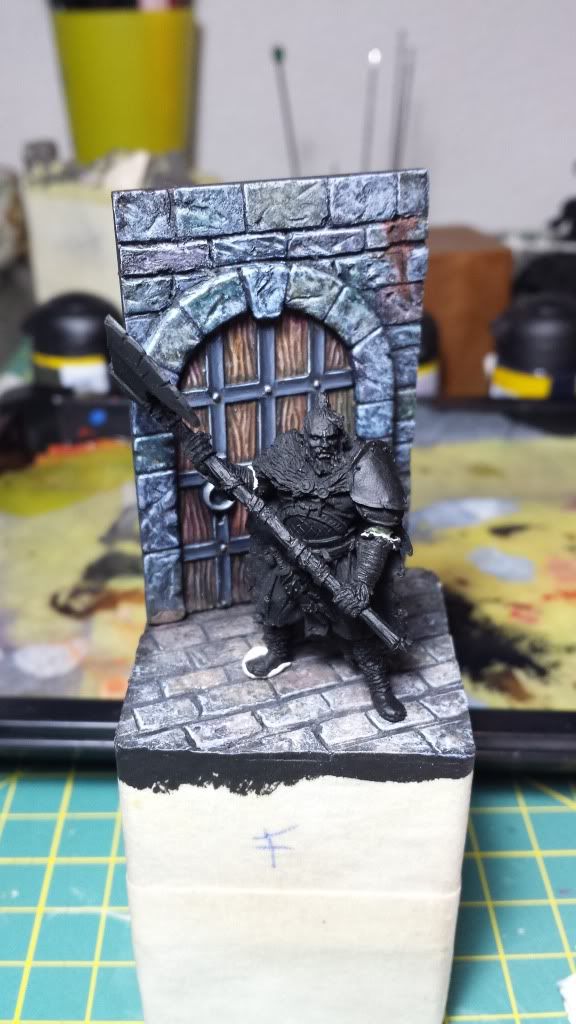
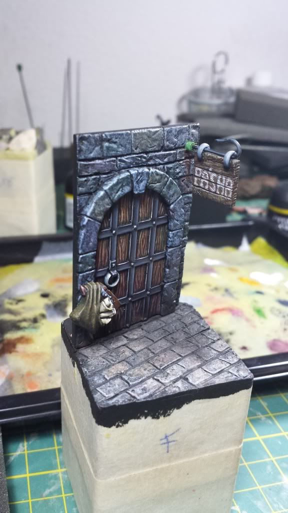
The actual state:


And a question. Do you think the dwarf statues could be a good added to the diorama or maybe its too many things in such small space? I'm not quite sure if I have explained correctly myself because my english is not the best one

Hope you like the idea and the way I'm doing it. Please feel free to leave a comment or advice me.
Many thanks.
Bye!